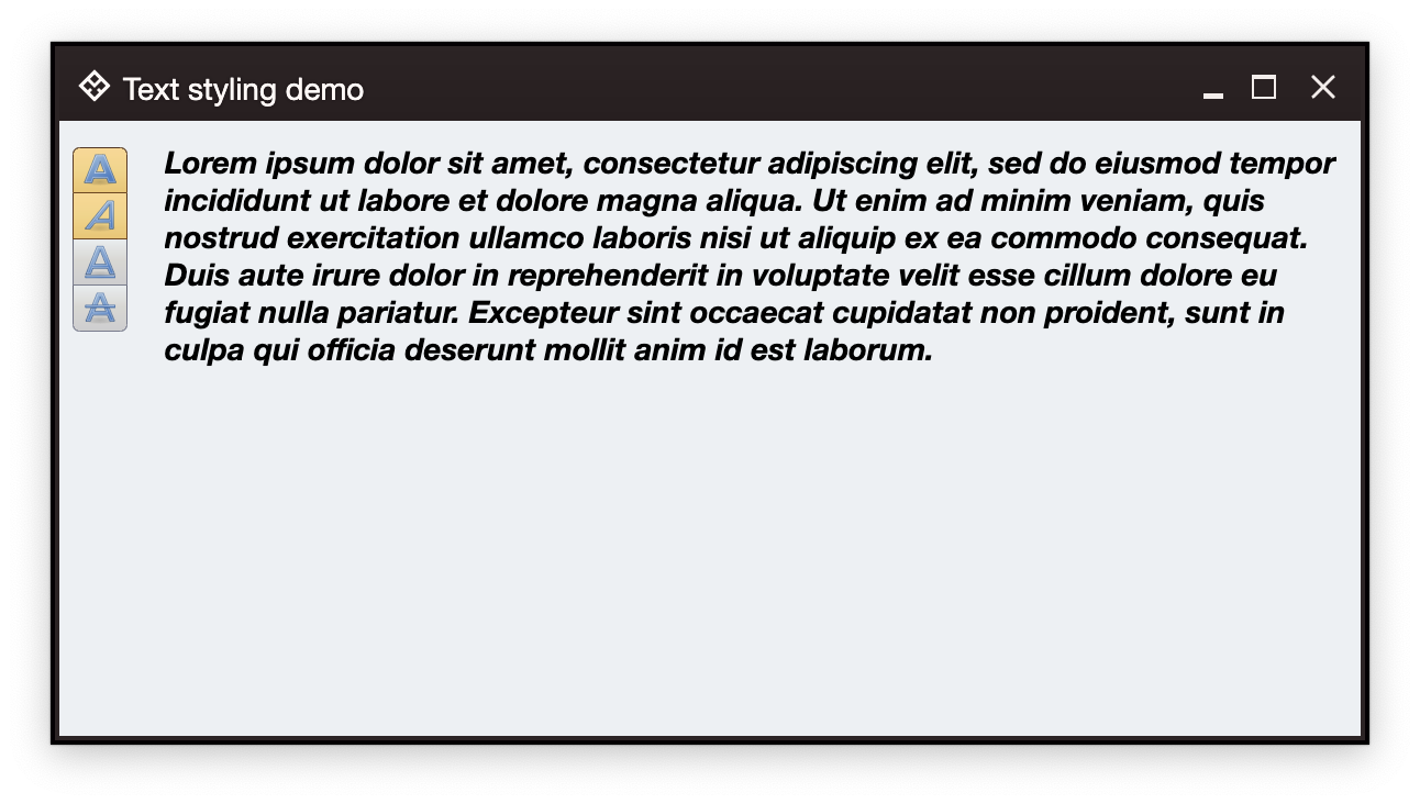
Command strip is a logically and visually connected group of commands (and their projections). In the screenshot above the four styling commands - bold, italic, underline, strikethrough - are grouped together to reinforce the logical connection of the underlying functionality.
CommandGroup is the content model, and CommandStripPresentationModel is the presentation model for command button strips.
The orientation attribute can be used to specify whether the strip buttons should be laid out horizontally or vertically.
The commandPresentationState attribute determines the visual presentation of the strip commands in the projected buttons.
The horizontalGapScaleFactor and verticalGapScaleFactor can be used to control the space around the icons of the projected buttons:
The backgroundAppearanceStrategy attribute controls the background appearance of the projected buttons.
CommandButtonStripProjection is the projection that combines CommandGroup content model and CommandStripPresentationModel presentation model. The result of its project function is a command button strip composable.
First we create four toggle commands:
// Bold style command
val commandBold = Command(
    text = "Bold",
    icon = format_text_bold(),
    isActionToggle = true,
    isActionToggleSelected = bold,
    onTriggerActionToggleSelectedChange = { bold = it }
)

// Italic style command
val commandItalic = Command(
    text = "Italic",
    icon = format_text_italic(),
    isActionToggle = true,
    isActionToggleSelected = italic,
    onTriggerActionToggleSelectedChange = { italic = it }
)

// Underline style command
val commandUnderline = Command(
    text = "Underline",
    icon = format_text_underline(),
    isActionToggle = true,
    isActionToggleSelected = underline,
    onTriggerActionToggleSelectedChange = { underline = it }
)

// Strikethrough style command
val commandStrikethrough = Command(
    text = "Strikethrough",
    icon = format_text_strikethrough(),
    isActionToggle = true,
    isActionToggleSelected = strikethrough,
    onTriggerActionToggleSelectedChange = { strikethrough = it }
)
And then we create a CommandGroup content model and a CommandStripPresentationModel presentation model, combine them together into a CommandButtonStripProjection and then call project() to get a composable that is added to the component hierarchy of our application:
CommandButtonStripProjection(
    contentModel = CommandGroup(
        commands = listOf(
            commandBold,
            commandItalic,
            commandUnderline,
            commandStrikethrough
        )
    ),
    presentationModel = CommandStripPresentationModel(
        orientation = StripOrientation.Vertical,
        commandPresentationState = CommandButtonPresentationState.Small,
        horizontalGapScaleFactor = 0.75f
    )
).project()Continue to command panels.