I am currently unable to actively maintain this library. While I continue to use it in my projects, I am facing time constraints that prevent me from dedicating proper attention to its maintenance.
Please understand that I may not be able to address issues, implement new features, or release updates at this time. However, I intend to resume maintenance as soon as I find the necessary resources.
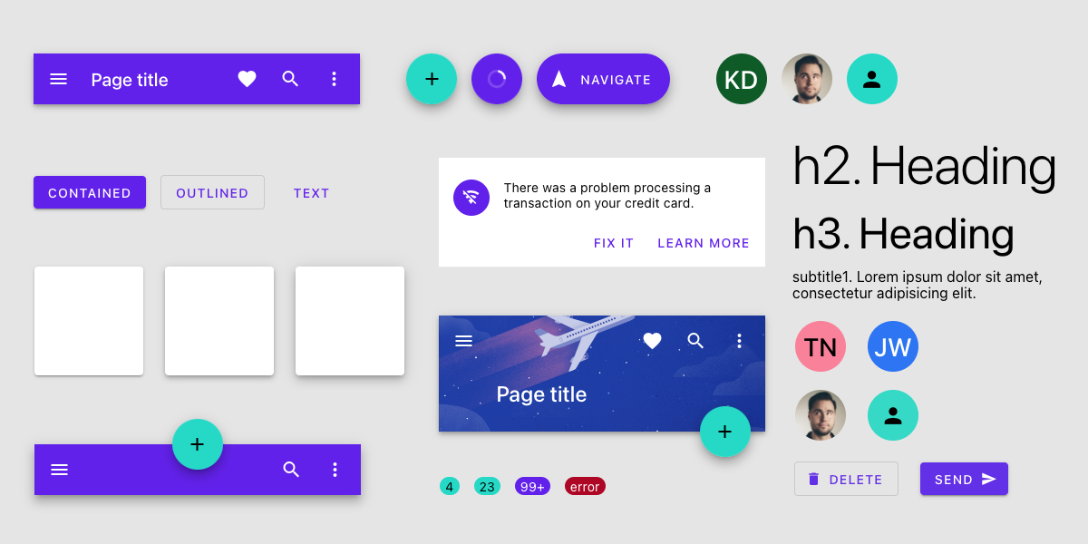
React Native Material is a set of pre-built, cross-platform, highly customizable UI components that follow Material Design principles.
Loved the project? Please share it with your friends and give it a ⭐️
Take a look at our example apps:
Download Expo Go app on your device and scan this QR code to get started.
Expo Go for iOS does not include a QR code scanner learn more. So you have to scan the code using the regular camera app.
Run the example app with Expo to see it in
action. The source code is located under the /example folder.
npm install @react-native-material/coreOr (If you're using yarn):
yarn add @react-native-material/coreHere's a quick example to get you started, it's literally all you need:
import React from "react";
import { Button } from "@react-native-material/core";

export default function App() {
  return <Button title="Button" onPress={() => alert("hi!")} />;
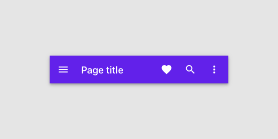
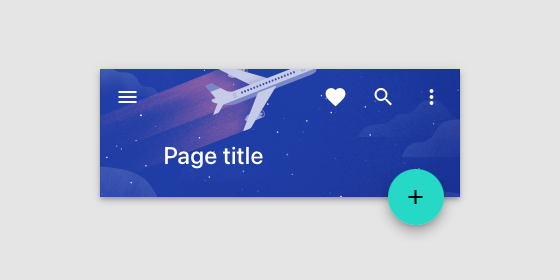
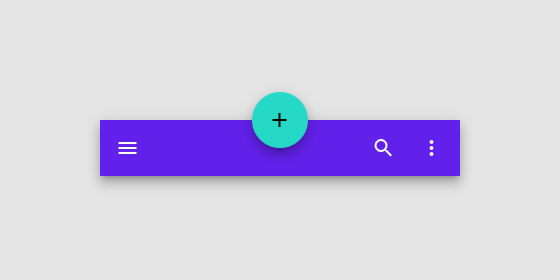
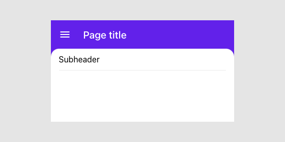
}The App bars display information and actions relating to the current screen.
Avatars are found throughout material design with uses in everything from tables to dialog menus.
A backdrop appears behind all other surfaces in an app, displaying contextual and actionable content.
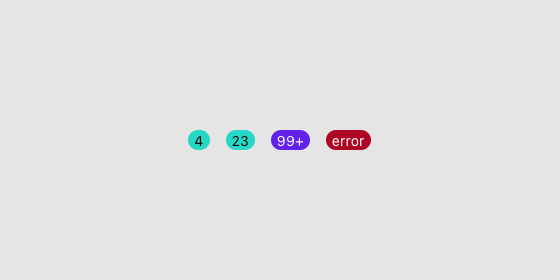
A Badge represents dynamic information such as several pending requests in a Bottom Navigation or Tab Bar.
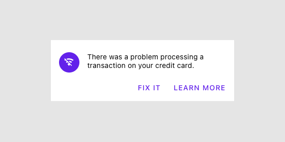
A banner displays a prominent message and related optional actions.
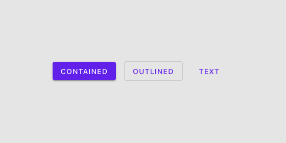
Buttons allow users to take actions, and make choices, with a single tap.
A divider is a thin line that groups content in lists and layouts.
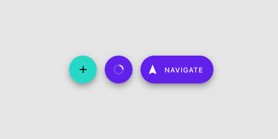
A floating action button (FAB) represents the primary action of a screen.
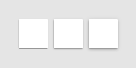
Material surfaces can be displayed in different shapes. Shapes direct attention, identify components, communicate state, and express brand.
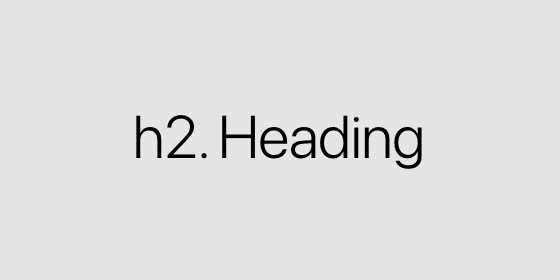
Use typography to present your design and content as clearly and efficiently as possible.
The community is your first stop for questions and advice about the framework. Welcome to the community!
For crowdsourced answers from expert React Native Material developers in our community. StackOverflow is also frequented, from time to time, by the maintainers of React Native Material.
React Native Material uses GitHub issues as a bug and feature request tracker. If you think you have found a bug, or have a new feature idea, please start by making sure it hasn't already been reported or fixed . You can search through existing issues and pull requests to see if someone has reported one similar to yours.
Please take a look at Kanban where we have a roadmap for React Native Material community. Also, we have a list of good first issues that contain bugs that have a relatively limited scope. This is a great place to get started, gain experience, and get familiar with our contribution process.
This library is licensed under the MIT License - see the LICENSE file for details.


