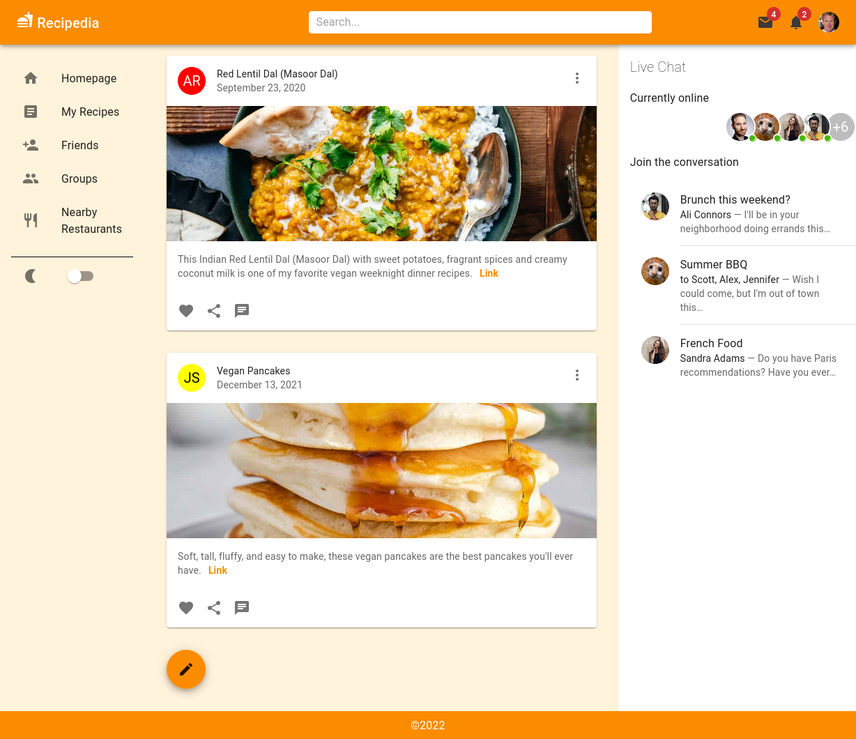
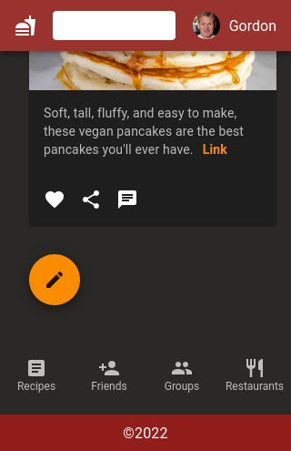
This project is a UI showcase with otherwise limited functionality. I created it as a presentation during bootcamp to demonstrate the power of the React component library MaterialUI/MUI. Apart from a color variable, the font-family and resetting margin, nothing is styled with vanilla CSS.
The look of the webpage is achieved with MaterialUI's highly customizable UI components, which provide out-of-the-box solutions for styling and layout, like pre-defined breakpoints for responsive behavior, as well as an easy, effective way to modify each and every component to create unique and individual designs. Additionally, MUI components also come with built-in functionality for user interaction, simplifying the process of changing the UI based on React state changes and reducing the amount of JavaScript code the developer has to write.
The Profile page solely exists as a bonus showcase for another styling tool, the CSS-in-JS styling framework styled-components. The code for the profile page shows how easily and quickly you can set up styling rules within the JavaScript file and how effective styled-components can be when utilizing its feature to react to props added to its components: defining a default style for a component with the option to replace it on a case by case basis, based on individual modifiers.
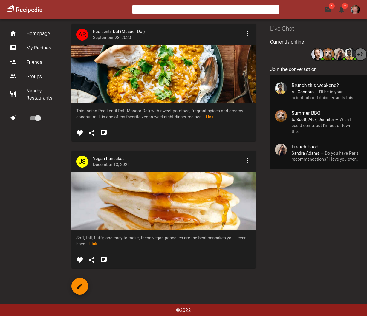
- Switch between light and dark mode
- Toggle a modal/pop-up window with the floating action button on the bottom
- Dropdown menu when clicking on user's avatar icon
- Envelope icon opens and closes on click
- Fully responsive for all screen sizes


After cloning this repository from Github, use the terminal to cd into the folder, then run npm install.
After that, run npm start and keep your terminal window open and running while using the application locally.
- React v18.2.0
- React Router v6
- JavaScript
- MaterialUI (MUI)
- styled-components