Visual Customization
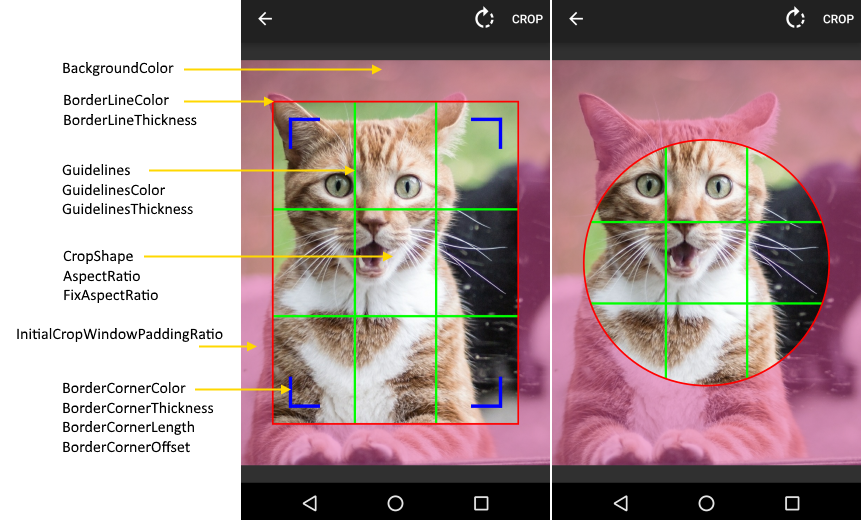
All customization properties can be set as attributes on CropImageView (crop prefix):
<com.theartofdev.edmodo.cropper.CropImageView
  xmlns:custom="http://schemas.android.com/apk/res-auto"
  android:id="@+id/cropImageView"
  android:layout_width="match_parent"
  android:layout_height="0dp"
  android:layout_weight="1"
  custom:cropGuidelines="on"
  custom:cropShape="oval"
  custom:cropBorderLineColor="@android:color/holo_red_dark"
  custom:cropGuidelinesColor="@android:color/holo_green_dark"
  custom:cropBorderLineThickness="5dp"/>
or set for CropImageActivity using builder (set prefix):
Note: the dimension properties are all in pixels.
CropImage.activity(imageUri)
  .setGuidelines(CropImageView.Guidelines.ON)
  .setCropShape(CropImageView.CropShape.OVAL)
  .setBorderLineColor(Color.RED)
  .setGuidelinesColor(Color.GREEN)
  .setBorderLineThickness(getResources().getDimensionPixelSize(R.dimen.thickness))
  .start(this);
some are possible to change at run-time on CropImageView instance:
cropImageView.setGuidelines(CropImageView.Guidelines.ON);
cropImageView.setCropShape(CropImageView.CropShape.OVAL);Default: FIT_CENTER
Options for scaling the bounds of cropping image to the bounds of Crop Image View.
Some options are affected by auto-zoom, if enabled.
- FIT_CENTER: Scale the image uniformly (maintain the image's aspect ratio) to fit in crop image view.
- CENTER: Center the image in the view, but perform no scaling.
- CENTER_CROP: Scale the image uniformly (maintain the image's aspect ratio) so that both dimensions (width and height) of the image will be equal to or larger than the corresponding dimension of the view (minus padding).
- CENTER_INSIDE: Scale the image uniformly (maintain the image's aspect ratio) so that both dimensions (width and height) of the image will be equal to or less than the corresponding dimension of the view (minus padding).
Default: Rectangle
Set crop window shape to Rectangle or Oval, use FixAspectRatio for Square / Circle.
Default: on-touch
Whether the guidelines within the crop window will be displayed.
- off: no guidelines will be displayed.
- on: guidelines will always be displayed.
- on-touch: guidelines will be displayed when the crop window is touched.
Default: 1 / 1
Sets the value of the aspect ratio, the ratio between the width and height dimensions of the crop window.
Default: false
Is the aspect ratio can be freely changed by the user or is it fixed to set values.
Default: true
Is auto-zoom feature is enabled: zoom-in when crop window is smaller than 50% of cropping image and zoom-out when larger than 65%.
Default: 4
The maximum zoom-in allowed for auto-zoom.
Default: 0.1 (10%)
The padding of the initial crop window from the edges of the cropping image.
If FixAspectRatio is set then the larger dimesion will be set while the smaller will adjust by aspect ratio.
Set to 0 for initial crop window to fully cover the cropping image.
Default: #77000000
The color of the crop overlay outside of crop window area, covering parts of the cropping image outside of the crop window.
Make sure the background has some transparency so the cropping image will be visible.
Default: #AAFFFFFF
The color of the crop window border lines.
Default: 3dp
The thickness of the crop window border lines.
Default: #FFFFFF
The color of the crop window corner lines.
Default: 2dp
The thickness of the crop window corner lines.
Set to 0 to remove.
Default: 5dp
Offset of the crop window corner lines from the border lines.
Set to 0 place on top of the border lines.
Default: 14dp
The length of crop window corner lines from the crop window corner.
Default: #AAFFFFFF
The color of guidelines inside the crop window.
Default: 1dp
The thickness of guidelines inside the crop window.
Default: 3dp
An edge of the crop window will snap to the corresponding edge of the cropping image when the crop window edge is less than or equal to this distance away from the bounding box edge.
Set to 0 to disable snapping.
Default: true
Is the crop overlay, crop window with surrounding background, is shown over the cropping window.
Can be used to hide during frame transitions.
Default: true
Is default progress bar UI is shown during async image loading and cropping.
Allow disabling to provide custom progress UX.
Default: 40dp/40dp
The minimum size the crop window can be.
Ensures proper crop window UI without its parts drawn over itself and too small for proper touch.
Auto-zoom enables to select very small parts without violating the minimum crop window size.
