Add: Preset gradient functionality button block #17169
Conversation
 jorgefilipecosta
added
[Type] Enhancement
jorgefilipecosta
requested review from
ajitbohra,
chrisvanpatten,
ellatrix,
gziolo,
Soean,
talldan and
youknowriad
as code owners
jorgefilipecosta
force-pushed
the
update/extact-circular-option-picker-internal-component-containing-color-palette-design
branch
from
jorgefilipecosta
added
[Type] Enhancement
jorgefilipecosta
requested review from
ajitbohra,
chrisvanpatten,
ellatrix,
gziolo,
Soean,
talldan and
youknowriad
as code owners
jorgefilipecosta
force-pushed
the
update/extact-circular-option-picker-internal-component-containing-color-palette-design
branch
from
efcc261
to
71e4eb4
Compare
|
🎉🎉🎉🎉 |
|
as per today's editor chat, there has been a discussion of whether we should use classes for gradients or directly inline them. in my point of view, I think classes are the best, most compatible solution in case of updating & or changing the visual identity |
|
Regarding the default set of gradients: I think the main use case for this will actually be outside of the button block: for black(or white)-to-transparent gradients above images in the Cover block. If we plan on adding this functionality to that block, we should include those in this default set too. For color ones, I think we should just choose a few subtle ones that are based on the default set of colors we use. So here's an example set:
... each with a left-to-right and top-to-bottom variant. That would result in 12 swatches, which is coincidentally the same number that we include by default for colors today. |
|
Also yes, I think these should follow the standard set by colors: so these should be defined by classnames. If we allow for users to create their own custom gradients later down the road, those would be inlined, just like the custom colors are today. |
In addition to some of Kjell's example above, I'd like to see a cool gradient and warm gradient if it's not too much. I can see these gradients being used as backgrounds to the Group block and Cover block. Cool
Warm
I'd also agree that classnames would be wonderful here. 👍 |
 jorgefilipecosta
force-pushed
the
update/extact-circular-option-picker-internal-component-containing-color-palette-design
branch
from
jorgefilipecosta
force-pushed
the
update/extact-circular-option-picker-internal-component-containing-color-palette-design
branch
from
71e4eb4
to
914631f
Compare
jorgefilipecosta
force-pushed
the
add/preset-gradient-functionality-button-block
branch
from
ff41c4b
to
0b4f447
Compare
jorgefilipecosta
force-pushed
the
update/extact-circular-option-picker-internal-component-containing-color-palette-design
branch
3 times, most recently
from
ccb0f00
to
89d00c5
Compare
|
Hi @mapk, @kjellr, I updated the PR to use the suggested backgrounds. |
I think I'm actually still seeing the old colors here?
Yeah, that makes sense. Something like this:
We could draw that grid as an SVG behind the gradient. Here's a sample SVG to try. Trying this out, I'm wondering if it actually makes sense to have these exist in their own panel in the first place? Since these gradients are colors, I'd expect to find them appended to the rest of the color swatches:
|


 jorgefilipecosta
force-pushed
the
add/preset-gradient-functionality-button-block
branch
from
jorgefilipecosta
force-pushed
the
add/preset-gradient-functionality-button-block
branch
from
0b4f447
to
3256474
Compare
|
Hi @kjellr,
Sorry, I missed to push my update it should be fixed now.
I will try to add this transparency mark.
Soon we will have a custom gradients functionality I opted for a separate panel to not make a single panel very huge. |
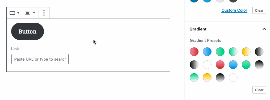
Looking through, I only see a few. Are we missing the gradients I had suggested earlier? Here's what I'm seeing right now. I notice the color white by itself is included there. And two of the Black-to-white gradients are duplicated.
|
 jorgefilipecosta
force-pushed
the
add/preset-gradient-functionality-button-block
branch
from
jorgefilipecosta
force-pushed
the
add/preset-gradient-functionality-button-block
branch
from
3256474
to
6127f7e
Compare
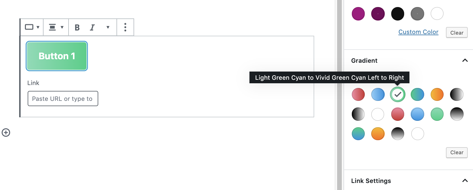
Hi @mapk the gradients you suggested Vivid Green Cyan (# 00d084) to Vivid Cyan Blue (# 0693e3) and Luminous Vivid Amber (# fcb900) to Luminous Vivid Orange (# ff6900) was there, but I wrongly set one of the transparency values the problem was fixed.
Hi @mapk the color white is White to Transparent, and one of the Black-to-white gradients is, in fact, a black to transparent. Both white and transparent were suggested as noted before we will need a way to indicate transparency (the typical white and dark squares). I hope to add this functionality very soon. |
|
The transparency indication was added now we can differentiate between white and transparent gradients: Props to @kjellr for providing the transparency SVG! |

|
I took the liberty of pushing a rebase, because it went smoothly and fixed some block registration issues that were otherwise present in master. However for some reason Github seems to still think there are conflicts with master, that I don't see in the checked out code. Any idea what this might be? |
|
I'm so excited for gradients to land, I took a stab at making a wider range of presets. The idea being that if we are launching V1 with presets ONLY, and not yet with a UI to customize those presets, it's important we launch with a range of high quality and widely useful gradients right off the bat. So I made these:
You could also see this as a bold first step and the next immediate step right after being to let you customize those presets using the UI outlined in #16662. Props @onuro, as I used some of the gradients they provided in the sketch file on that thread.
Let me know what you think! |

Excellent reasoning, @jasmussen! In the future we can add a gradient direction control as you noted.
Nooooo! Alrighty, I get your point. 😉 In context of the Button block, this makes sense. |
|
It should be possible to define gradient in PHP using |
jorgefilipecosta
force-pushed
the
add/preset-gradient-functionality-button-block
branch
from
babd035
to
fdd3f52
Compare
jorgefilipecosta
requested review from
adamsilverstein,
aduth,
atimmer,
noisysocks,
oandregal and
swissspidy
as code owners
jorgefilipecosta
force-pushed
the
update/extact-circular-option-picker-internal-component-containing-color-palette-design
branch
from
1c1ebd2
to
72b8a23
Compare
Hi @spacedmonkey, yes the plan is for themes to be able to change the default gradient presents. When this is merged the following step is a custom gradient component and in parallel, we will add the theme API's |
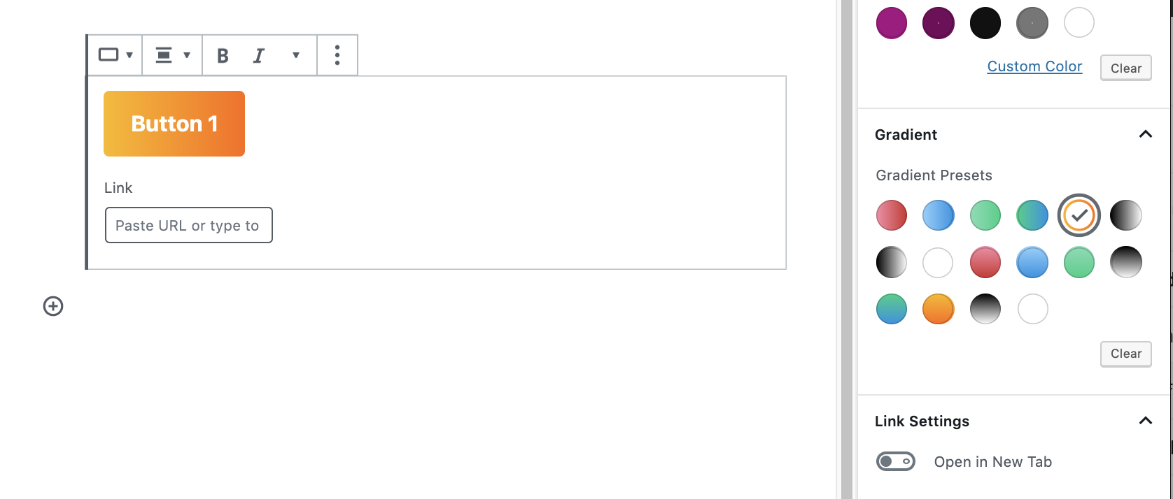
This commit changes a few things. It:

- Removes all duplicate presets and leaves only top left to bottom right gradients. As presets, these are arguably more dynamic when using them, compared to vertical or horizontal.
- It adds a range of gradients built using the stock Gutenberg color palette colors.
- It adds a couple of additional gradients using new colors.
- Removes the transparent gradients for now, as they aren't useful yet on the button. We can add back later on.

Will elaborate in a comment. (+2 squashed commits)
Squashed commits:
[a37cac983] Add transparency indication.
[f7aa9f8a7] Add: Preset gradient functionality button block
jorgefilipecosta
force-pushed
the
add/preset-gradient-functionality-button-block
branch
from
fdd3f52
to
08fc902
Compare
jorgefilipecosta
changed the base branch from
update/extact-circular-option-picker-internal-component-containing-color-palette-design
to
master
jorgefilipecosta
force-pushed
the
add/preset-gradient-functionality-button-block
branch
from
08fc902
to
2cc4b3d
Compare
jorgefilipecosta
force-pushed
the
add/preset-gradient-functionality-button-block
branch
from
2cc4b3d
to
ecbdd51
Compare
|
Created a follow up issue here. #17774 |
|
Button blocks with gradients are currently considered invalid blocks when loaded on multisite WordPress install. I created an issue with more context: #17938 |
Description
Implements: #16482
Related: #16662
This PR adds a set of Gradient related functionality and components and uses them to implement gradient functionality in the button block.
For now, we still don't have a custom gradient functionality we just have gradient presets.
Themes will be able to configure gradient presets. But we need a default set of gradients when themes did not pass their own set. I think this set is not very creative and we should look into having an awesome set :)
cc: @mapk, @kjellr
How has this been tested?
I added the button block. I used the gradient panel and I verified the preset gradients work as expected.
Screenshots