Chrome: Try reorganizing the editor's header #2878
Conversation
Codecov Report
@@            Coverage Diff             @@
##           master    #2878      +/-   ##
==========================================
- Coverage   33.95%   33.92%   -0.03%
==========================================
  Files         191      190       -1
  Lines        5690     5695       +5
  Branches      997      999       +2
==========================================
  Hits         1932     1932
- Misses       3180     3183       +3
- Partials      578      580       +2
Continue to review full report at Codecov.
|

|
I'm really liking this. |
editor/header/index.js
Outdated
| <ModeSwitcher /> | ||
| <SavedState /> | ||
| <Tools /> | ||
| <div className="editor-header__left"> |
There was a problem hiding this comment.
Can we use a more semantic class? Maybe editor-header__content-tools and editor-header__settings for the right one?
editor/header/index.js
Outdated
| <div className="editor-header__left"> | ||
| <Inserter position="bottom right" /> | ||
| <IconButton | ||
| className="editor-tools__undo" |
There was a problem hiding this comment.
Shouldn't the namespace be the file component?
There was a problem hiding this comment.
yep sorry, copy/paste
| .editor-publish-button.is-saving:disabled { | ||
| position: relative; | ||
|
|
||
| // These styles overrides the disabled state with the button primary styles |
There was a problem hiding this comment.
@jasmussen is this something we need upstream?
There was a problem hiding this comment.
Good question. I don't know what the best approach is, here — looking at it now I'm worried that we might have a blue disabled button, even if a user has a different admin color scheme.
Long term one would hope we had a single "button-primary" component that has this all baked in, instead of multiple disparate CSS that's competing.
64267f6
to
ea98213
Compare
- Normalize the margins between items
- Tweak the alignment and size of the publish button
- Make the Settings cog have a background when toggled, and match the size of the publish button
5df2c03
to
b66aac6
Compare
|
A lot of this was inspired by @afercia and @hedgefield and #467, particularly the discussions around grouping the save state indicator with the publish button. I'm curious of your thoughts on this design, Andrea. |
|
@jasmussen grouping and separating content related actions and document/editor related actions makes lot of sense to me. It is a nice improvement. Also the logical sequence: seems good to me. Not sure about a couple details and it doesn't address the sidebar toggle issue yet but to me this is an improvement. 🙂 I've probably missed some of the recent changes, quick questions:
|
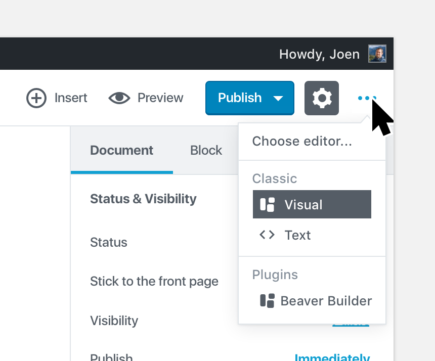
I think this got buried in another ticket or PR, my apologies, but it is related to the PR to allow users to edit the HTML on a per-block basis (#2797). It's not fully fleshed out yet, but basically the ellipsis would be the mode switch:
It could potentially also be pluggable, so global actions like for example spell check, could live there. |
Description
This changes the UI of the Editor's moving all the content related actions to the left and the document related actions to the right.
Screenshots (jpeg or gifs if applicable):