Block API: Add block styles variations API #7362
Conversation
 youknowriad
added
the
[Feature] Block API
youknowriad
added
the
[Feature] Block API
|
It would be nice if rather than having a fixed This would then allow for this API to be utilised for existing websites rather than having to adapt. |
I wonder if it's a good idea to adapt the API to existing websites. I tend to think while we have the opportunity to change things, we should seek for the best API instead and a naming convention seems better to me for the moment, it makes it clear where the classname comes from. Also, this doesn't break anything since we have the "deprecated versions" API so block that upgrade to use this new API can adapt pretty easily without breakage. |
core-blocks/quote/index.js
Outdated
| @@ -66,6 +60,10 @@ export const settings = { | |||
| attributes: blockAttributes, | |||
|
|
|||
| transforms: { | |||
| styles: [ | |||
|
|
||
| return ( | ||
| <Toolbar controls={ styles.map( ( variation ) => ( { | ||
| icon: variation.icon, |
There was a problem hiding this comment.
I don't think we'd want to attach the style variation to an icon, since we are likely to drop that approach for quotes. I imagine initially we'd just show a custom button in Quote toolbar to toggle between the registered styles. Once we build the proper UI for style variations we'd just remove the toolbar item.
|
Two things that are more vague related thoughts than anything else…
EDIT: And also worth noting that I am super super excited for this functionality :) |
|
@mtias @chrisvanpatten yes, the
In general, I think if extending block requires more than adding a className or buttons to update existing block attributes, I tend to think we should probably think about creating a separate block transformable to the current block using the transforms API instead of trying to extend the existing blocks. |
I had a long response typed out but it kind of felt unnecessary haha. Ultimately I think if folks need to change markup for a core block, they should absolutely be encouraged to create a custom block and leverage the existing transforms API. However I think it's also fair that custom blocks, who use this API to provide alternate designs for a block, may need small markup changes between variants within a single block that don't warrant creating an entirely separate block. However, as long as the style format attribute is available to the custom block, the API doesn't need to worry about anything. It just manages the UI and the attribute, and lets the custom block determine how that information impacts the rendered and saved content, beyond adding it as a class name. It seems like that's already happening here, however, so I think everything's in good shape :) |
The other problem is this introduces too many variations that would be hard to account in validation stages, particularly if the plugin extending a core block is disabled — the block would become invalid, and we wouldn't have knowledge of which transformations to apply. Restricting variation of variants to classes would allow people to extend blocks without the overhead of creating their own, but without suffering from invalidation hurdles. |
|
@mtias I'm not referring to extending existing blocks, only to custom blocks. I agree completely that if you're extending an existing block, you should be limited to class names. But authors of completely custom blocks might want access (or even need access, in the case of server-rendered blocks) to this attribute. |
|
Oh, sure, the attribute should totally be exposed as it'd be useful in many scenarios. |
youknowriad
force-pushed
the
add/style-variations-api
branch
from
33efa85
to
6173aa8
Compare
|
Ok, so I've pushed this further and implemented the UI proposed by @karmatosed Instead of using an "example" to preview the style, I'm using the current block's content. |
This is clever, good call. |
|
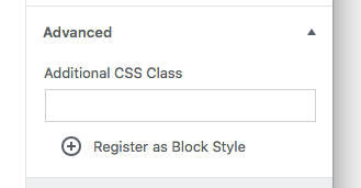
There is one more thing here that I'd like to ponder, which is how it could relate to the "additional CSS class" panel.
I'm thinking it could be neat to let user write a class and click a button to register that class as a block style variation:
Thinking further, we could even let you write CSS targeting this specific class, and we'd apply it to the block / miniature automatically. All this is definitely not for this issue :) |

|
Updated the PR, I used a grid view to the block transforms similar to the inserter and added an e2e test. Should we land this an iterate? |
|
|
||
| // Check the content | ||
| const content = await getHTMLFromCodeEditor(); | ||
| expect( content ).toMatchSnapshot(); |
There was a problem hiding this comment.
How much work it would be to add validation if the class name starting with is-type* has been applied to the block's HTML code?
There was a problem hiding this comment.
You mean a regex to catch the className or something?
I mean we can add it but we do have unit tests to test the functions applying and retrieving those classNames.
There was a problem hiding this comment.
Probably XPath expression offered by Puppetter API would be sufficient, but yes, this is what I thought about.
There was a problem hiding this comment.
It's a blurry territory between e2e and unit tests, if it is covered already then it's fine to skip this suggestion.
|
Pushed change to use the small block icon with colors and drop the down arrow.
|

|
When the popover switches to the top, some of the containing elements break out of it:
|

|
Closes #7227. |
|
@mtias Did you fix the extra border showing up when the popover switches to the top? I can't reproduce in my testing. |
|
I didn't. |
|
This looks really great so far thanks for all the work on it. One thing I did wonder about is there anything we can do about the formatting on the style variants?
Above you can see what happens with the default text and it looks weird to have one so small and the other on two lines. |

|
@karmatosed What we can probably do is to give a minimum width to the preview and use Though, I think no matter what we do, we'd still have styling issues because the blocks are not meant to be shown in such a small area. |
|
What's the a11y impact of having the live nested block previews, vs an SVG or raster image? Do screen readers try to read out or navigate the blocks? |
Sorry about the typo.
- Bug: the body text was not the same gray as the title. This fixes that.
- The new Dots separator style is simpler, smaller, better centered, and uses the same color as the text.
- The wide separator style is now thinner.
- Rename remaining instance of "asterisks" to "dots"
- Move default separator style to theme.scss so it can be opted into
- Scope default style so it doesn't bleed into dots and wide styles
- Refine dots and wide styles to better work on frontend
youknowriad
force-pushed
the
add/style-variations-api
branch
from
8dcfed4
to
d720cab
Compare
|
I rebased. I'm seeing intermittent e2e test failures preventing the merge. Let's see how it goes this time. |
@jasmussen — I've got you covered there. 🙂WordPress/gutenberg-starter-theme#64 can be merged in to fix that. |
| // Jest Snapshot v1, https://goo.gl/fbAQLP | ||
|
|
||
| exports[`adding blocks Should switch the style of the quote block 1`] = ` | ||
| "<!-- wp:quote {\\"className\\":\\" is-style-large\\"} --> |
There was a problem hiding this comment.
Thinking we might have the tendency to be not be giving close attention to the snapshots 😅 Note the leading whitespace, and the double space in the next line.
Happy they exist though, as I believe they may have captured a legitimate issue in #9105.
| <div className="editor-block-styles"> | ||
| { styles.map( ( style ) => { | ||
| const styleClassName = replaceActiveStyle( className, activeStyle, style ); | ||
| /* eslint-disable jsx-a11y/click-events-have-key-events */ |
There was a problem hiding this comment.
This is an unfortunate instance of blindly disabling a rule for which its entire purpose is to protect against the thing we've introduced here.
This is the first step towards #783
It adds a
transforms.stylesBlock API to support style variations per block. It works by adding anis-style-{styleName}className to the custom className per block.This PR replaces the style variations of the quote block by this new API. It keeps the UI similar for now.
Testing instructions
Visuals