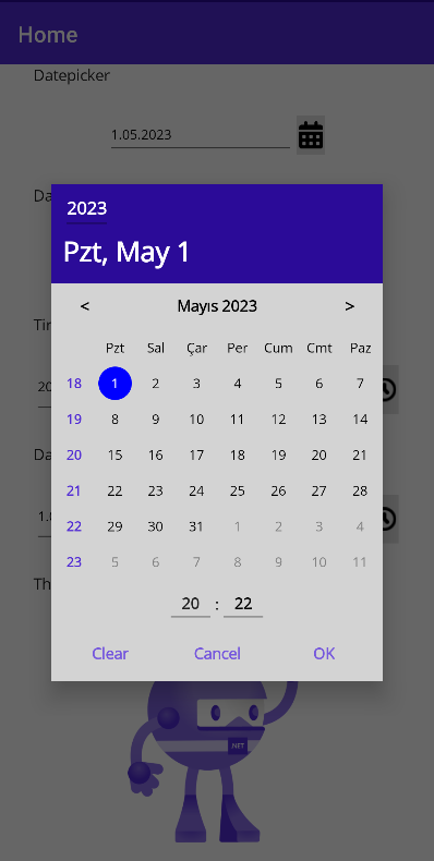
The Nullable DateTimePicker is a custom calendar control for selecting a nullable date and time value in a .NET MAUI application. It provides a consistent and platform-independent user interface for selecting dates, and allows the user to clear the value if needed.
This control uses the CommunityToolkit.Maui Popup.
To use the Nullable DateTimePicker control in your .NET MAUI application, follow these steps:
0- Add .ConfigureNullableDateTimePicker() to the MauiProgram.cs file in your project.
public static MauiApp CreateMauiApp()
{
    var builder = MauiApp.CreateBuilder();
    builder
    .UseMauiApp<App>()
    .ConfigureNullableDateTimePicker()
    //.UseMauiCommunityToolkit() //For versions 1.0.2 and earlier
    ....
1- Add your entry or button for datetime in your xaml page (eg. MainPage.xaml)
<HorizontalStackLayout HorizontalOptions="Fill"  HeightRequest="40">
    <Entry Text="{Binding MyDateTime, StringFormat='{0:g}'}"
    HorizontalOptions="Fill"
    VerticalOptions="Fill"
    IsReadOnly="True">
        <Entry.GestureRecognizers>
            <TapGestureRecognizer Tapped="DateTimePicker_Clicked" />
        </Entry.GestureRecognizers>
    </Entry>
    <ImageButton Source="{Binding CalendarIcon}"
    Clicked="DateTimePicker_Clicked"
    HorizontalOptions="Fill"
    VerticalOptions="Fill"
    Margin="0"
    Padding="2"
    WidthRequest="30" />
</HorizontalStackLayout>
2- Then, when you click on the button or entry, define the options and call NullableDateTimePicker.OpenPopupAsync(options) to open the calendar in your xaml.cs file. (eg. MainPage.xaml.cs)
private async void DateTimePicker_Clicked(object sender, EventArgs e)
{
    INullableDateTimePickerOptions nullableDateTimePickerOptions = new NullableDateTimePickerOptions
    {
        NullableDateTime = MyDateTime,
        PickerMode = PickerModes.DateTime,
        ShowWeekNumbers = true
        // .. other options
    };

    var result = await NullableDateTimePicker.OpenPopupAsync(nullableDateTimePickerOptions);
    if (result is PopupResult popupResult && popupResult.ButtonResult != PopupButtons.Cancel)
    {
        MyDateTime = popupResult.NullableDateTime;
        // DateTimeEntry.Text = popupResult.NullableDateTime?.ToString("g"); //If you are not using ViewModel
    }
}
1- Add the NullableDateTimePicker control to your XAML layout file:
xmlns:ndtp="clr-namespace:Maui.NullableDateTimePicker;assembly=Maui.NullableDateTimePicker"
<ContentPage xmlns="http://schemas.microsoft.com/dotnet/2021/maui"
             xmlns:x="http://schemas.microsoft.com/winfx/2009/xaml"
             xmlns:ndtp="clr-namespace:Maui.NullableDateTimePicker;assembly=Maui.NullableDateTimePicker"
             x:Class="Maui.NullableDateTimePicker.Samples.MainPage">
2- Bind the DateTime? value property to a property in your view model:
<ndtp:NullableDateTimePicker NullableDateTime="{Binding MyDateTime}" Mode="Date" />
More examples, please see the samples project
| Option | Description | Default Value |
|---|---|---|
| NullableDateTime | Gets or sets the nullable date and time value of the control. | null |
| Mode | Specifies the mode of the control. Valid values are Date, DateTime, and Time. | Date |
| Format | Specifies the display format for the date or time. | for date: d, for datetime: g, for time: t |
| MinDate | Minimum selectable date of the control. | DateTime.MinValue |
| MaxDate | Maximum selectable date of the control. | DateTime.MaxValue |
| OkButtonText | The text for the OK button. | OK |
| CancelButtonText | The text for the Cancel button. | Cancel |
| ClearButtonText | Gets or sets the text for the Clear button. | Clear |
| ShowClearButton | Clear button can be hidden/shown. If true, the button is displayed. | true |
| ForeColor | It is used for the color of texts that cannot be styled in the calendar. | Black |
| BackgroundColor | Background color of the calendar. | White |
| HeaderForeColor | Gets or sets the foreground color of the control's header. | White |
| HeaderBackgroundColor | Background color of the control's header. | #2b0b98 |
| ToolButtonsStyle | Style of the control's tool buttons. | null |
| DayStyle | Style of the days in the calendar. | null |
| SelectedDayStyle | Style of the selected day in the calendar. | null |
| DayNamesStyle | Style of the day names in the calendar. | null |
| OtherMonthDayStyle | Style of the other month days in the calendar. | null |
| WeekNumberStyle | Style of the week numbers in the calendar. | null |
| ShowWeekNumbers | Determines whether to display week numbers in the calendar. | false |
| ShowOtherMonthDays | Determines whether to display other month days in the calendar. | true |
The NullableDateTimeChanged event is used to indicate when a NullableDateTime value has been changed. This event is commonly used in programming or software environments and is triggered when the NullableDateTime value is modified.
The event utilizes the DateTimeChangedEventArgs class as its argument. The DateTimeChangedEventArgs class contains additional information that is carried at the moment the event is triggered. It may include details about the date and time change, such as the old DateTime value and the new DateTime value.
Below is an example code snippet illustrating the usage of the "NullableDateTimeChanged" event and the "DateTimeChangedEventArgs" argument class:
NullableDateTimePicker dateTimePicker = new NullableDateTimePicker();
dateTimePicker.NullableDateTimeChanged += OnNullableDateTimeChanged;

private static void OnNullableDateTimeChanged(object sender, DateTimeChangedEventArgs e)
{
    Console.WriteLine("DateTime changed!");
    Console.WriteLine("Old DateTime: " + e.OldDateTime);
    Console.WriteLine("New DateTime: " + e.NewDateTime);
}
The Nullable DateTimePicker control is licensed under the MIT License. See LICENSE file for more information.
Contributions are welcome!
on ios, android, windows
- The calendar popup can be opened directly via the NullableDateTimePicker, so you can use your own entry and button.
- A Builder Extension has been added. In this way, Configure Nullable DateTimePicker can be used without adding CommunityToolKit to your own project.
- On some screens, week and day numbers were not displayed on the same line.
- Dark theme adjusted
-
The problem of displaying the default icon in default mode has been fixed.
-
Various improvements.
- The problem of not setting the margin has been fixed.

