You signed in with another tab or window. Reload to refresh your session.You signed out in another tab or window. Reload to refresh your session.You switched accounts on another tab or window. Reload to refresh your session.Dismiss alert
{{ message }}
This repository has been archived by the owner on Oct 28, 2019. It is now read-only.
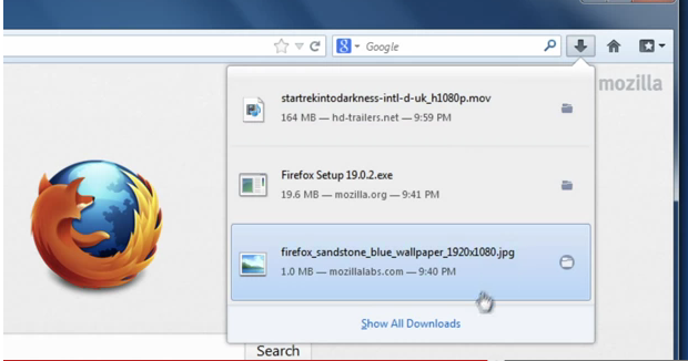
In the download popup the last item is always highlighted in dark blue background, but it has black text. That makes it a bit hard to read. If you mouse over any item, it also uses the dark blue background, but shows the text white.
Second, the default highlight should be better readable, e.g. at least use a white text.
Third, maybe we could have black text everywhere and use a very light blue background instead, similar to Windows? I'm not a fan of text color inversions on mouse over. But it's true that Mac theme does the same (see the link above).
Windows theme:
The text was updated successfully, but these errors were encountered:
In the download popup the last item is always highlighted in dark blue background, but it has black text. That makes it a bit hard to read. If you mouse over any item, it also uses the dark blue background, but shows the text white.
First, it's a bit confusing that two items can be highlighted at once. I don't know if is it theme issue or Firefox issue. If you look at https://support.mozilla.org/en-US/kb/find-and-manage-downloaded-files , I don't see default highlight of the last item anywhere.
Second, the default highlight should be better readable, e.g. at least use a white text.
Third, maybe we could have black text everywhere and use a very light blue background instead, similar to Windows? I'm not a fan of text color inversions on mouse over. But it's true that Mac theme does the same (see the link above).
Windows theme:

The text was updated successfully, but these errors were encountered: