-
-
Notifications
You must be signed in to change notification settings - Fork 5.5k
New issue
Have a question about this project? Sign up for a free GitHub account to open an issue and contact its maintainers and the community.
By clicking “Sign up for GitHub”, you agree to our terms of service and privacy statement. We’ll occasionally send you account related emails.
Already on GitHub? Sign in to your account
Align label with checkbox #21660
Align label with checkbox #21660
Conversation
 Gusted
commented
Nov 2, 2022
- Follow up from Configure update checker on installation page #21655 (comment)
- Use vertical-align and line-height to get it to align exactly with the checkbox.

- Follow up from
go-gitea#21655 (comment)
- Use vertical-align and line-height to get it to align exactly with the checkbox.
|
Take a look at other checkbox code. IIRC it should be like this: No more CSS style / ID / FOR is needed. |
|
It should work. I made a fix. The problem was that the width of |
|
I'm not a big fan of moving the helper text inside |
dd91b71
to
511e011
Compare
|
I reverted my changes. But the Maybe let other maintainers to decide. |
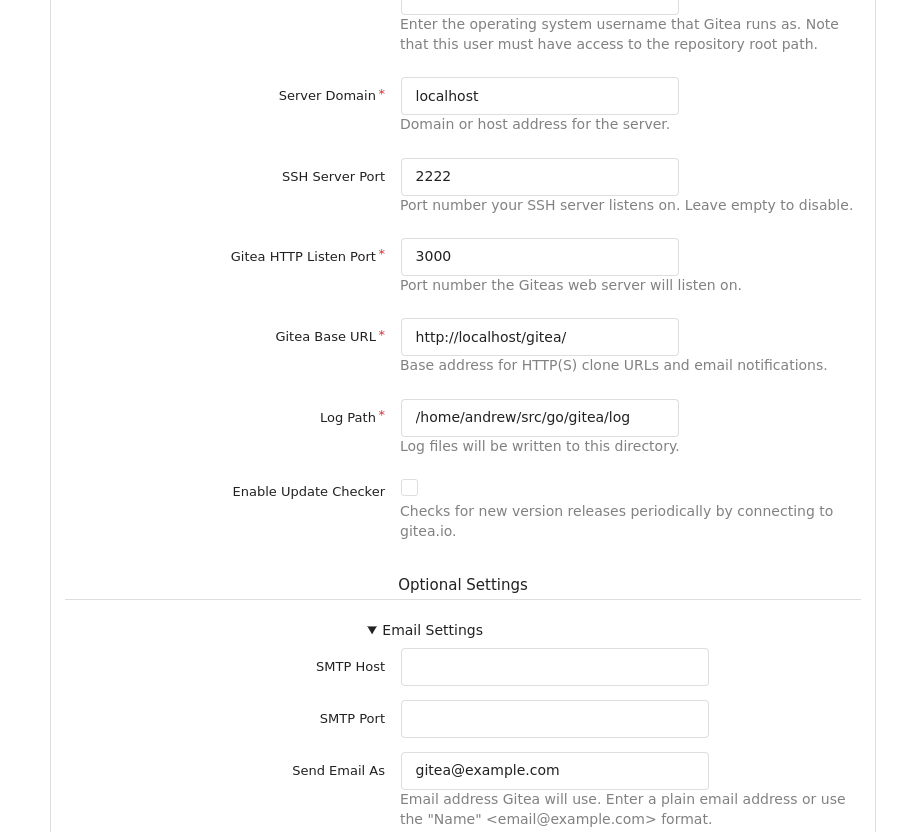
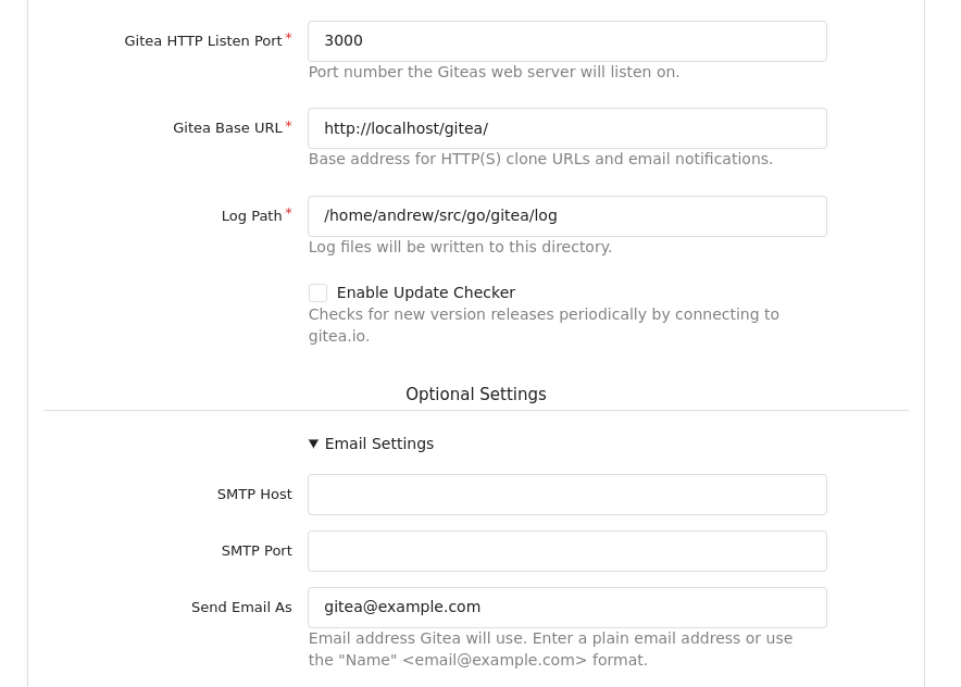
The install page has been somewhat inconsistently styled for a while. This PR simplifies
and standardises the styling of these fields makes things line up better across widths.

Replace go-gitea#21660

Signed-off-by: Andrew Thornton <[email protected]>
The install page has been somewhat inconsistently styled for a while. This PR simplifies and standardises the styling of these fields makes things line up better across widths. Replace #21660 Signed-off-by: Andrew Thornton <[email protected]> Old:  New:  Signed-off-by: Andrew Thornton <[email protected]>
|
Replaced by #21668 |
|
Thanks @Gusted for spurring me to look at this |

