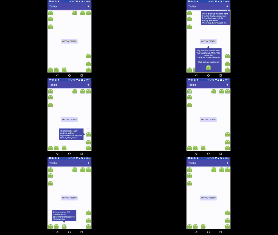
This is a lightweight library to show Tooltips dynamically in your app. This tooltip does not require any custom layout. It works out of the box with all the layouts.
Here's a short gif showing how it works.
Tooltip uses Builder pattern to created immutable Tooltips.
Tooltip tooltip = new Tooltip.Builder(contenxt)
                    .anchor(anchorView, Tooltip.BOTTOM)
                    .content(contentView)
                    .into(root)
                    .withTip(new Tip(tipWidth, tipHeight, tipColor))
                    .show();
That's it. It's that simple. You can customize the size and color of the tip to match color of the content view.
repositories {
    maven {
        url  "http://dl.bintray.com/jayrambhia/maven"
    }
}
repositories {
    jcenter()
}
dependencies {
    implementation 'com.fenchtose:tooltip:0.1.6'
}
repositories {
    maven {
        url  "https://jitpack.io"
    }
}

dependencies {
    implementation 'com.github.jayrambhia:Tooltip:0.1.7-1'
}
anchor(View view)- set anchor view with position asTooltip.TOPanchor(View view, @Position int position)- set anchor view with positioncontent(View view)- set content view of the tooltipanimate(@NonNull TooltipAnimation animation)- set Animation for Show and DismisswithTip(@NonNull Tip tip)- setTipof the tooltip.into(ViewGroup viewGroup)- set ViewGroup into which the tip is to be shownautoAdjust(boolean adjust)- if you want the tooltip to adjust itself if going out of boundcancelable(boolean cancelable)- if you want the tooltip to dismiss automatically if clicked outside. Default is truewithPadding(int padding)- distance from the anchor and screen boundariesautoCancel(int timeInMS)- if tooltip should be dismissed automatically after given time. If value is <= 0, auto cancel is offwithListener(@NonNull Listener listener)- Attach dismiss listener.debug(boolean debug)- Enable debugging mode. Default is false.checkForPreDraw(boolean check)- Check if the anchor is drawn or not and then only draw the tooltip
Tip is drawn as an isosceles triangle. The length of the base is defined by width and perpendicular length between top vertex and base is defined by height.
width- length of the base of isosceles triangleheight- length of the perpendicular from top vertex to the basecolor- Color of the tiptipRadius- Corner radius of the tip
TooltipAnimation just holds type of the animation to be performed and duration of the animation
type- Type of animation -FADE,SCALE,REVEAL,SCALE_AND_FADEduration- Animation duration in millisecondshideContentWhileAnimating- Content of the tooltip will be hidden when it's animating in or out. This will not work if the content is a View and not a ViewGroup.
Animations are a bit tricky in this library. FADE and REVEAL are applied on the container of the tooltip
with appropriate parameters. So if the container has some background color, it looks really weird. The same
method can't be applied for SCALE because it doesn't draw the tooltip properly. So in SCALE, the animation
is applied on Tooltip's content view (and if tip is present, it will be there as it is not part of the content view).
To avoid this eye sore, you may use SCALE_AND_FADE, it does SCALE and FADE so the poor effect is not visible.
REVEAL uses Circular Reveal and hence is supported for API 21 and above.
When a view(eg. FAB) is anchored to another view in the CoordinatorLayout and you try to draw a tooltip
as that view as anchor, it doesn't work properly. I'm assuming that CoordinatorLayout first draws fab and them moves? I don't know.
Anyway, an onPreDrawListener listener has been added and once the event is received, tooltip is laid out.
By default, this method is not performed. To perform this method, use checkForPreDraw(true) while creating the builder.
- Customizable tips
- Shadow
- Improve and add more animations
NoCropper binaries and source code can be used according to the Apache License, Version 2.0.
