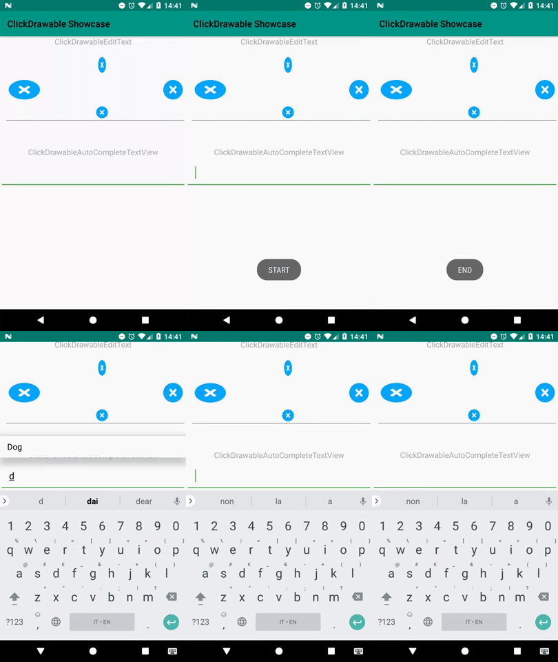
This library add the ability to listen for drawable click events for TextView, EditText and AutoCompleteTextView normally added in XML
with android:drawableStart etc... or in code with setCompoundDrawables(...) and similar.
Also with this library you can flat a layout used to side any widget with an ImageView or ImageButton added to listen for click on the icon, to one unique custom view.
For example converting this XML:
<LinearLayout
    android:layout_width="match_parent"
    android:layout_height="wrap_content"
    android:orientation="horizontal">
    <TextView
            android:layout_width="0dp"
            android:layout_weight="1"
            android:layout_gravity="center_vertical"
            android:layout_height="wrap_content"
            android:text="this textview looks nice" />
    <ImageView
            android:layout_width="30dp"
            android:layout_height="30dp"
            app:srcCompat="@drawable/my_icon" />
</LinearLayout>
Into this:
<com.matpag.clickdrawabletextview.ClickDrawableTextView
        android:layout_width="match_parent"
        android:layout_height="wrap_content"
        android:text="this textview looks nice"
        app:csEndDrawable="@drawable/my_icon"
        app:csEndDrawableHeight="30dp"
        app:csEndDrawableWidth="30dp"/>
Removing a ViewGroup, removing inefficient weights and adding a lot more functionalities.
This GIF shows a ClickDrawableEditText with clickable drawables all around it (please never do this in a real app, it's really unpleasant :D) and a ClickDrawableAutoCompleteTextView with support for blocking inputs after user choice, until cancel icon is pressed.
You can play with an interactive demo here
   implementation "com.matpag:clickdrawabletextview:3.1.0@aar"

   //required dependency
implementation "com.android.support:appcompat-v7:${versions.supportLib}"Use one of the theme from Theme.AppCompat.* for your application theme.
Call CsDrawableSettings.init(Context context, String packageName) in the onCreate of your custom Application class.
In this way:
public class AppApplication extends Application {
    @Override
    public void onCreate() {
        super.onCreate();
        //Init the library
        CsDrawableSettings.init(this, BuildConfig.APPLICATION_ID);
    }
}
then you need to change your AndroidManifest.xml to load your custom
application class instead of the default one adding the
android:name".AppApplication" (you should update the path accordingly based on
where you created the AppApplication class) to the manifest if you already didn't.
Something similar to this:
<application
        android:name=".AppApplication"
        android:allowBackup="true"
        android:icon="@mipmap/ic_launcher"
        android:supportsRtl="true"
        ....>

        <!-- Other declarations -->

</application>(Enabled only on API 17+ because the support for RTL was added in API 17, lower API level will have the default layout direction to LTR)
If you want to support RTL, you simply need to add android:supportsRtl="true" to the application tag in your AndroidManifest.xml and the library will handle everything for you.
The library provides 3 custom views with extended functionalities for drawables.
Each of them it's extending the AppCompat counterpart class for max compatibility with every supported SDK version
The custom drawables are CsDrawables objects.
You can add a CsDrawable via XML or via Code, below you can find both the implementations.
After declaring
xmlns:app="http://schemas.android.com/apk/res-auto"in the top parent layout, you can specify the custom properties shown below in any of the supported views.
To add the drawable to the view in position you need, you can use:
app:csStartDrawable="@drawable/my_icon"
app:csEndDrawable="@drawable/my_icon"
app:csTopDrawable="@drawable/my_icon"
app:csBottomDrawable="@drawable/my_icon"
providing a reference to a drawable of any type (png, xml drawable, vector drawable)
If you don't specify any size for the drawable, automatically the drawable will be sized to the width and height of the drawable itself (called intrinsic in the android platform).
If you dont want to resize your original drawable resource (and you really shouldn't if not necessary), i suggest you to specify the width and the height in dp you need using:
app:csStartDrawableHeight="30dp"
app:csStartDrawableWidth="30dp"
for the Start drawable
app:csEndDrawableHeight="30dp"
app:csEndDrawableWidth="30dp"
for the End drawable
app:csTopDrawableHeight="30dp"
app:csTopDrawableWidth="30dp"
for the Top drawable
app:csBottomDrawableHeight="30dp"
app:csBottomDrawableWidth="30dp"
for the Bottom drawable.
If you need to handle the initial visibility of the drawable(s) you can use
app:csStartDrawableVisible
app:csEndDrawableVisible
app:csTopDrawableVisible
app:csBottomDrawableVisible
(default is true)
You can add a Tint(Single color or reference to ColorStateList) and a TintMode to the drawable(s) with
app:csStartDrawableTint
app:csEndDrawableTint
app:csTopDrawableTint
app:csBottomDrawableTint
app:csStartDrawableTintMode
app:csEndDrawableTintMode
app:csTopDrawableTintMode
app:csBottomDrawableTintModeUse this XML as example
<com.matpag.clickdrawabletextview.ClickDrawableEditText
        android:id="@+id/click_drawable_edit_text"
        android:layout_width="match_parent"
        android:layout_height="wrap_content"/>
Get the reference in code as usual
ClickDrawableEditText mCdEditText = (ClickDrawableEditText)findViewById(R.id.click_drawable_edit_text);Create a CsDrawable object using the builder class
CsDrawable csDrawable = new CsDrawable.Builder(this, R.drawable.ic_close_red_24dp, true)
                .setDrawableDpSize(30, 30) //or .setDrawablePixelSize(width, height) for pixel
                .setVisibility(false) //optional, default true
                .build();
Now you can add the CsDrawable to the view using one (or more) of the following methods
mCdEditText.addStartCsDrawable(csDrawable);
mCdEditText.addTopCsDrawable(csDrawable);
mCdEditText.addEndCsDrawable(csDrawable);
mCdEditText.addBottomCsDrawable(csDrawable);
To change the visibility later, you can use
mCdEditText.showStartCsDrawable(true | false);
mCdEditText.showTopCsDrawable(true | false);
mCdEditText.showEndCsDrawable(true | false);
mCdEditText.showBottomCsDrawable(true | false);Now that you have configured your ClickDrawable* view with one or more drawables. You can add a listener to the drawable(s) click events.
viewInstance.setOnDrawableClickListener(OnDrawableClickListener listener).
Example:
viewInstance.setOnDrawableClickListener(new OnDrawableClickListener() {
    @Override
    public void onClick(View view, DrawablePosition position) {
        Toast.makeText(context, "Touched " + position.name() + " drawable",
                Toast.LENGHT_SHORT).show();
    }
});
If you added more than 1 drawable to the view, you can create a switch case to distinguish between them
viewInstance.setOnDrawableClickListener(new OnDrawableClickListener() {
    @Override
    public void onClick(View view, DrawablePosition position) {
        switch (position){
            case START: startDrawableClicked(); break;
            case END: endDrawableClicked(); break;
        }
    }
});If you need to block the user after some action, for example after selecting an item in the ClickDrawableAutoCompleteTextView dropdown.
You can prevent the view from receiving the focus for editing with
viewInstance.disableFocusOnText(boolean preventReFocus, boolean closeKeyboard)
preventReFocus : Passing true, will prevent re-focus on another EditText in the same ViewGroup (if present)
closeKeyboard : Passing true, will close the keyboard (if actually open)
To re-enable the editing on the view simply call
viewInstance.enableFocusOnText(boolean openKeyboard);
openKeyboard : Passing true, will open the keyboard automatically (if actually closed)
You can find a concrete example of this use case in the sample app of the repository, in the ClickDrawableAutoCompleteTextView configured in MainActivity
Please open issues for bug fixes or feature requests and send pull request only after discussion in the related issue (to prevent waste of your time on something that can't be merged). If you find typos somewhere or a lack of documentation, feel free to create a pull request.
This project is licensed under the Apache License 2.0 - see the LICENSE file for details
