-
Notifications
You must be signed in to change notification settings - Fork 210
New issue
Have a question about this project? Sign up for a free GitHub account to open an issue and contact its maintainers and the community.
By clicking “Sign up for GitHub”, you agree to our terms of service and privacy statement. We’ll occasionally send you account related emails.
Already on GitHub? Sign in to your account
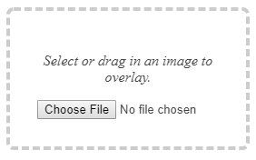
Fix no file chosen place #538
Conversation
|
Thanks for opening this pull request! |
There was a problem hiding this comment.
Choose a reason for hiding this comment
The reason will be displayed to describe this comment to others. Learn more.
Oh great work! Thanks @adiwahyudi02
Does this also take care of viewport size, I mean this would work on both smaller and larger devices?
|
i'm not sure, because i've set min-width statically |
|
Oh, It would be great if you can try it in different sized viewports, for that you can use you chrome dev tools, just inspect the page and try different screen sizes there. Thanks and great work! 😄 |
|
Will it not look good if the text is rendered below the button? |
@tech4GT This way will reduce the box size too. @adiwahyudi02 Follow up with this suggestion. |
|
I guess that can work too. |
|
This looks beautiful. Could we move it into |
|
@adiwahyudi02 are you still working on this? If yes then you should probably move the changes to |
|
Seems like this has been fixed. This PR is redundant. Can it be closed? @jywarren @gauravano |
|
Thanks for status update @harshkhandeparkar. This fix is not required due to change in page design @jywarren @tech4GT. Feel free to open the PR if you think anything can be optimized with this. Thanks @adiwahyudi02 for working on it! |
Fixes #356
Before
After

Add some styles for wrapper div
Thanks!