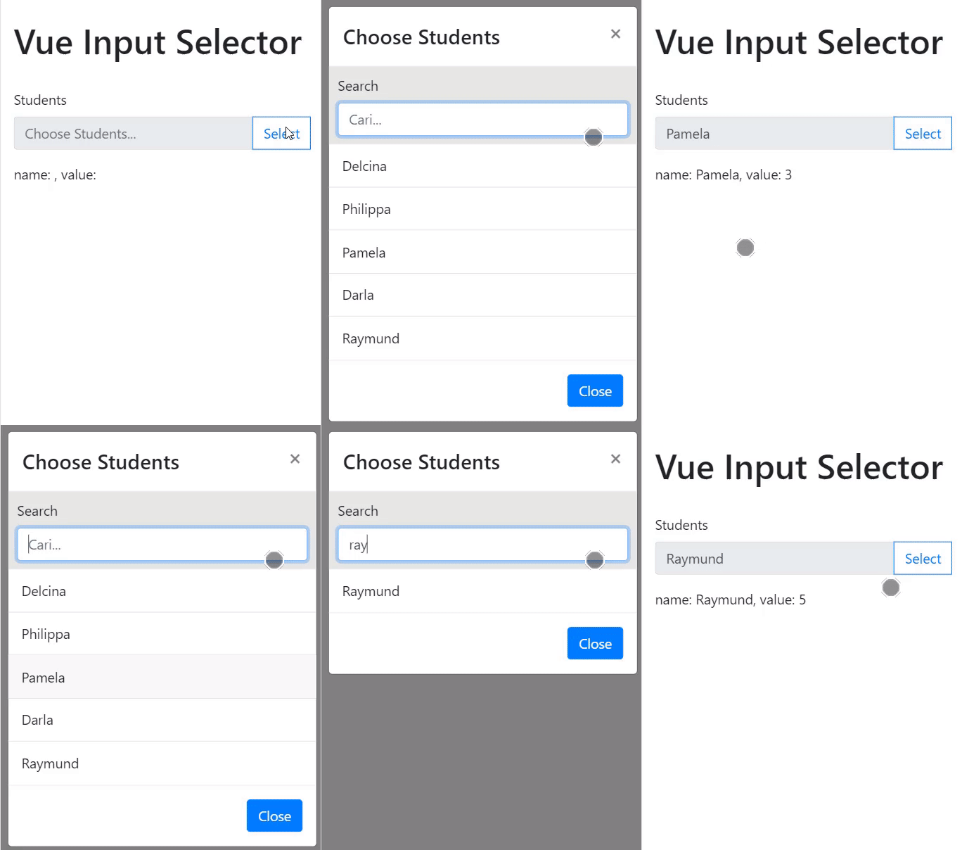
Vue input component with list selector powered by Bootstrap modal.
First you need Bootstrap Framework and jQuery, these instructions will get you a copy of the project up and running on your local machine.
Install the component
npm install --save-dev vue-input-selector
Import Vue and register this component at your main javascript file:
import Vue from 'vue'
import InputSelector from 'vue-input-selector'

Vue.component('InputSelector', InputSelector)
To display the interface, use input-selector element at your Vue component
<input-selector></input-selector>
All of these configurations/props are optional.
Set title of the selector, this will prefix with "Select "
List items with array of object, with key value and name.
Set "select" button disabled.
Message to display on "select" button is selected when disabled is True.
Add class is-invalid to input, default behavior of Bootstrap is the input box will have red border.
Message to show below the input when inputError value is True.
Show loading spinner
Only single event available, @select, which will return current selected object item.
<!-- app.vue  -->
<template>
  <div>
    <input-selector
      :items="customItems"
      :disabled="inputSelectorConfig.disabled"
      :disabledMessage="inputSelectorConfig.disabledMessage"
      :inputError="inputSelectorConfig.inputError"
      :errorMessage="inputSelectorConfig.errorMessage"
      :title="inputSelectorConfig.title"
      :busy="inputSelectorConfig.busy"
      @select="onStudentSelect">
    ></input-selector>

    <p>
      name: {{ selectedItem.name }}, value: {{ selectedItem.value }}
    </p>

  </div>
</template>

<script>
  export default {
    data(){
      return {
        selectedItem: {},
        inputSelectorConfig :{
          title : "Students",
          disabled : false,
          disabledMessage : "Disabled, try again later",
          inputError : false,
          errorMessage : "Well, something goes wrong",
          busy :false
        },
        customItems:
        [{
         "value": 1,
         "name": "Delcina"
         },
         {
         "value": 2,
         "name": "Philippa"
         },
         {
         "value": 3,
         "name": "Pamela"
         },
         {
         "value": 4,
         "name": "Darla"
         },
         {
         "value": 5,
         "name": "Raymund"
         }]
        }
    },
    methods:{
      onStudentSelect(item){
        this.selectedItem = item;
        this.inputSelectorConfig.inputError = false;
      }
    }
  }
</script>
Please read CONTRIBUTING.md for details on our code of conduct, and the process for submitting pull requests to us.
- Tony Song - tonywei92
This project is licensed under the MIT License
