Navigation Block: Future navigation block customization improvements. #16830
Comments
|
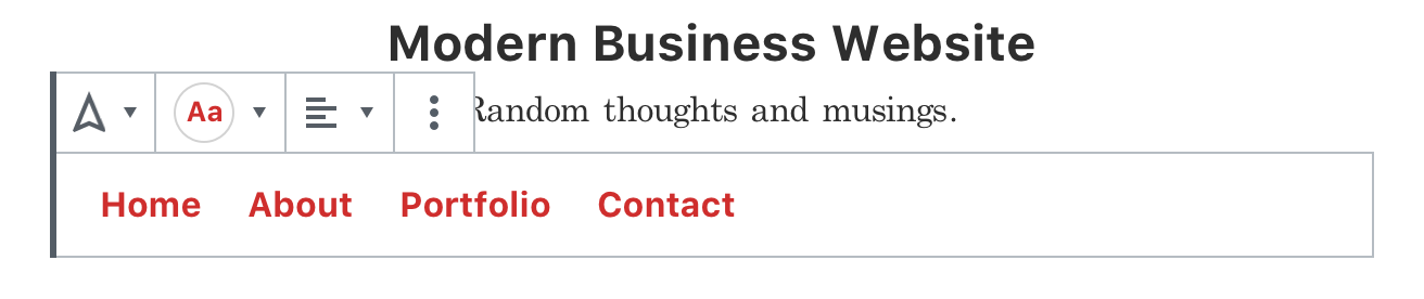
Here's a quick mockup showing what could be possible with a block-specific settings panel:
I want to explore how this could be a site-level setting, along with how/when we could use block-level styles to offer different options. |

|
Thinking a little about how we could use the block Styles:
Switching between styles would also mean that the color options would change. For example if you switched to the Button style, the color options would increase to include a background color. |

|
Perhaps not related to color (is this issue just about color?) is the alignment. I think we could add the standard alignment control (left, center, right) to the toolbar:
|
|
Lots to dig into here so I am just going to dive right in! @shaunandrews love the explorations here and particularly like the idea of some strong defaults, it really plays with the idea of customisation being extra and variations making it easy. I really like the idea of a site-level setting but as that feels a little further on I want to focus on what you show as per block for now. I do think it could have a setting to 'apply to all navigation blocks'. This probably is getting into the territory of 'saving a variation'. Alignment I sort of agree is for the toolbar here. You don't need anything else by the block itself. I also like it being per the entire navigation over every single element. I keep coming back to not seeing how useful that could be, it feels super-advanced and I do think for most cases per block makes sense. |
 mapk
added
Needs Design Feedback
mapk
added
Needs Design Feedback
ColorsThanks for mocking all this up, @shaunandrews! I know we've been looking into ways in which we can display font color in the toolbar (#16014), so this fits right in. Navigation stylesStyle variations seem like the right place for this, but where should layout styles be reflected? Like if the user wanted a vertical nav. AlignmentThis makes sense here. We probably should allow text alignment within the block. |
 noisysocks
added
[Status] Blocked
noisysocks
added
[Status] Blocked
|
Hey @shaunandrews, in regards to how you display the font/background colors in the toolbar, I was thinking of reflecting the common shape of "selected" and "hovered" items which is more a square with rounded corners in the toolbar instead of the circle.
|

I think we might be better off providing different blocks; One for a horizontal nav, and one for a vertical nav and let users transform between the two as needed. Doing it all in one block is likely too much.
I was trying to match the shape of the color selector in the sidebar, hoping to visually link to the UI's. I don't have a strong opinion either way. |
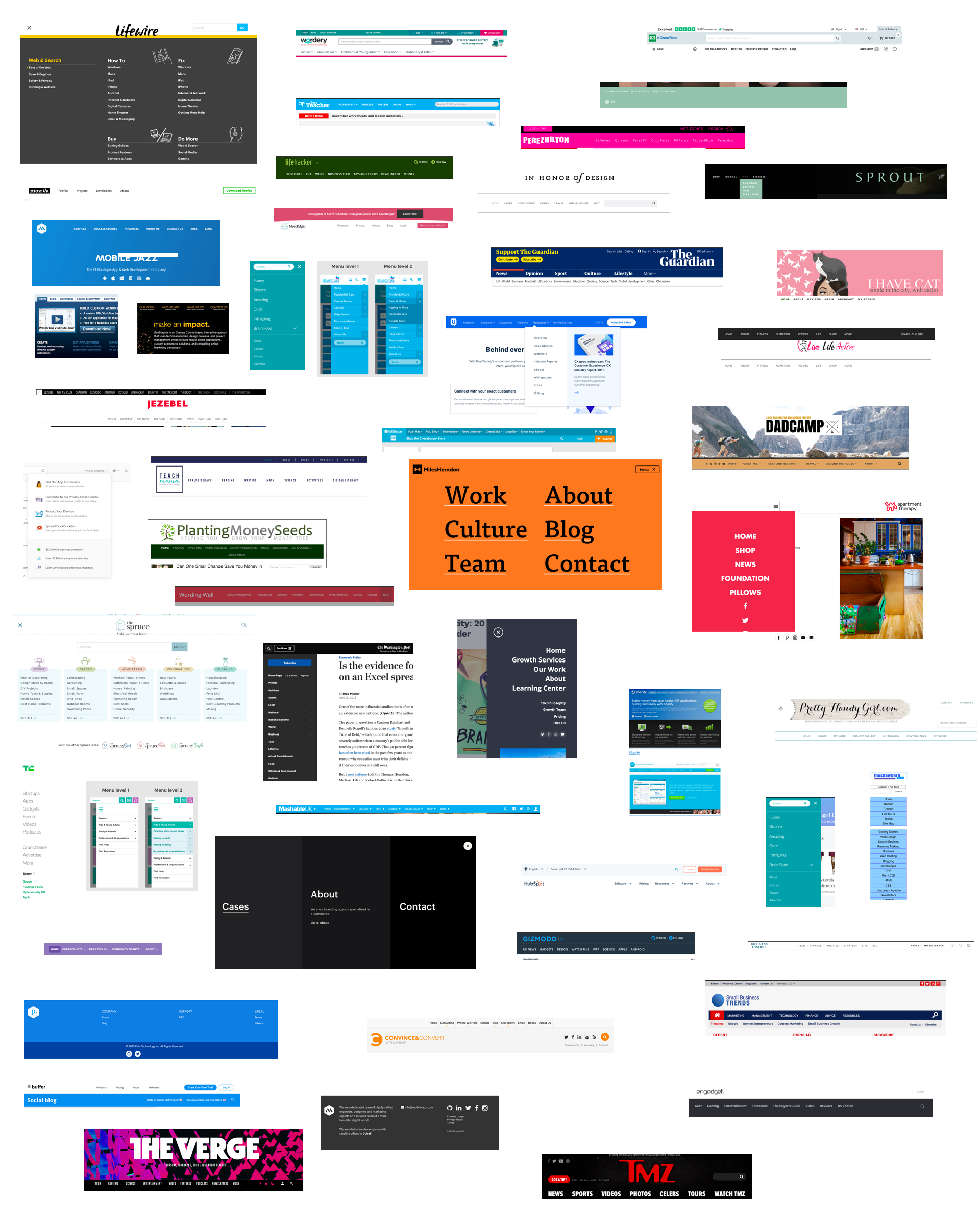
Exploring the problemNavigation menus come in all sorts of different shapes and sizes. How do we account for all the different variations that people may want to create? How do themes interface with these customizations? ResearchUnfortunately, we weren’t able to get aggregate data on different visual patterns and styles that people use in navigation menus. What we could find was an array of different styles, taken from different websites across the internet:
From these, we can see a number of patterns developing in terms of customizations that could be required. Suggested options
How these options might be presented to usersThe numbered items above are depicted below when a menu or menu item is selected.
Notes from above images:
Initial Questions
|


|
@mapk and @shaunandrews For me, the color being circular makes sense over a rounded rectangle as it's already defined for color picking. @mrcn thanks for all that exploring and research. I'm going to give some feedback but I am sure others have some also.
|
Simplifying the Toolbar@karmatosed - If we’re saying the toolbar diagrams surface too many options for users, making it hard to design and tricky for users to create and style the block, then I find myself wondering about a tension which ya'll are more familiar with. Basically, how to provide options without overwhelming users. 2 paths came to mind.
Path 1: Minimal, Leaning on Block StylesWhat if we lean on block styles for broad menu types and allow users to set some basic things (eg: color, font, etc. per usual). @shaunandrews includes a few block styles above in their horizontal form as links, buttons, tabs, ribbon. These same options could be imagined in a vertical nav (Going this path could probably benefit from additional menu style accounting, which I haven't done here. basically to determine what the 80/20 block styles are) This moves a ton of elements out of the tool bar, presumably decreases development complexity, and seems to adhere with some of the WP philosophy. Enabling additional user customization could be incorporated progressively as needed. Path 2: Less Minimal, Incorporating Options with DefaultsThis is the direction I started down, but I'm feeling Path 1 right now. In either case though, we'd have to decide what user customizations to offer. With that in mind, to what degree is there consensus for including any of the various user customizations below?
Questions
|
The more I think about this, the more I think we should offer different blocks for different orientations. That is, perhaps there should be a "Horizontal Site Nav" block and a "Vertical Site Nav" block. I haven't dove into the implications this would present over a single block, but my gut tell's me that having separate blocks might helps us simplify UI. |
I sort of wonder if this is what styles could do? I am all for simplifying this where possible, I am hitching a bit on having to at block selection decide what you want though. Absolutely something to explore though. @mrcn all those options for me still aren't minimal. For example, what could be done without a setting? Do people have to set a mobile version of could smart adaption happen? Could hover be based on the other combinations of color? |
|
It's definitely helpful to start from a bigger list of possibilities and then whittle down, so at least we have an idea of what users might want, and what we might need to potentially add in the future (and how those options might be presented.) This can help prevent a need to shoehorn in features at a later date, once we have a clearer assessment of user needs.
This sounds like a good approach at this stage. Path 1 definitely feels like the right direction to be heading in here. There's a great deal of inherent complexity in navigation menus, and reducing the complexity as much as we can now makes sense. In terms of minimising the number of configuration options, I'd suggest paring down the above list with two metrics in mind: Will it be used by 80% of users?WordPress philosophy argues that the core system should only include options that are likely to be used by 80% of users:
Unfortunately, we don't have a great way of measuring usage, but we can do our best to guess what might be required here, both by using intuition and by looking at common menus across different types of websites for patterns. Can it be accomplished by a parent (group) container block?This may require some discussion of what we consider to be a "menu" and what we don't—and what users, more importantly, think comprises a menu. So there are effectively two different approaches here. Let's take a typical menu from the page I was just looking at, which happens to be the Labour Party's website. (I am not a Labour Party voter, but someone deserves a prize for their 404 page right now. Also, the site is running WordPress.) Looking at their menu, we could say the whole top bar—the terrible gradient, the weirdly complex logo, the search, and the multiple call-to-action buttons, is the menu:
This builds a whole lot of inherent complexity into our menu, though, and we need to account for all kinds of child elements. What if, instead, we look at the "menu" part as just the list of pages inside the header, and we represent the full header instead with a Group block, which can have any number of child elements (search, buttons, logo, etc) in addition to the navigation menu:
This would allow us to simplify the navigation menu block to just its core user needs whilst still allowing for flexibility in the presentation and arrangement of the elements that are tied to that core menu. The trouble here, of course, is that mobile menus often contain a whole lot more than just a list of links:
How we account for mobile options (Do we allow for this level of complexity in the core system? Or would complex mobile menus be better served by plugins?) may influence whether we want to consider the "menu" to be the whole interactive block, or whether a "menu" should just be a list of links to other parts of your site. Thinking of the "menu" as just one small part of a larger site header like this does allow for a great deal of simplification in how we approach the menu block itself. We could potentially look at providing some pre-configured "site header" collections to allow users to quickly create a more complex "menu" for their site, whilst still keeping the individual menu block itself (relatively) simple. Narrowing scopeUsing this architecture, we can narrow our scope a little bit, like so:
|


|
I think scaling back the approach here is key. What is the minimum 'cupcake' of styling. For me that would be the following:
This is something we are exploring in background for columns, so for me ideal to bring into this. We could also maybe show just text. I wonder about combining both though.
I am wondering if styles even needs to be something for v1. I think we can then consider what needs different blocks and what needs to be added. Alignment for me is something we can then consider adding for v1. What do people think as for me this moves us into actually having something produced? |

|
What a delightful thread. I deeply appreciate and enjoyed seeing all the research and mockups. So much good stuff here! 👏👏👏 — Five star ticket. However, I wish it were TWO tickets:
This thread as it is with its treasure trove of mockups and ideas could more or less make up ticket number 2 as suggested, and it probably should. But we also want to be able to ship a basic navigation block soon — it can always be improved, and seeing real world usage might even suggest how to improve it. For example when it comes to tabs, accordions, dropdowns and all those features — what is the role of the WordPress theme to play? How much styling should the editor provide? Paddings, margins, border radiuses? Or is that the purview of the theme again? Because of that, I would suggest that Tammie's latest suggestion (#16830 (comment)) would make a perfect V1 for basic navigation block customization. However I would consider changing the "Background Color" feature to colorize the individual navigation menu item background, rather than the navigation menu entirely. If you want that, you can easily put it inside a group block. |
 karmatosed
changed the title
karmatosed
changed the title
|
I just changed the title so this is a focus on future :) The simplified focus will be: #17683 |
|
There's a ton of idea that we can still use to expand the block. Closing this as it's not very actionable on its own, but let's open individual issues for suggestions. |
It should be possible to customise the colours of a Navigation block to match a wide variety of themes and use cases.
The text was updated successfully, but these errors were encountered: