feat(theme): patch theme #497
Conversation
Co-authored-by: Kevin Granger <[email protected]>
|
This pull request is automatically built and testable in CodeSandbox. To see build info of the built libraries, click here or the icon next to each commit SHA. Latest deployment of this branch, based on commit ec98541:
|
| @@ -596,3 +762,34 @@ body { | |||
| display: none !important; // TODO: fix specificity issue | |||
| } | |||
| } | |||
|
|
|||
| //---------------- | |||
| // 10. Gradients | |||
There was a problem hiding this comment.
How do we use these? They look like they're meant to be reusable utilities, but seem quite specific to the use case of the bottom of the search results.
There was a problem hiding this comment.
We introduced them because couldn't find a CSS way to allow this gradient without panel footer (like in the demo) and with a panel footer (from the Layout API, similar to Search2).
Usage:
autocomplete({
  // ...
  render({ sections }, root) {
    render(
      <Fragment>
        <div className="aa-GradientTop"></div>
        <div className="aa-PanelLayout">{sections}</div>
      </Fragment>,
      root
    );
  },
});
|
We might want to enforce stricter rules in the stylelint configuration:
Is there a reason why we nulled them? |
|
I think I prefer the version of your sandbox @francoischalifour where we pass the grid template settings directly in the template. More flexible less custom to learn, i think it's an acceptable use of inline css. |
There was a problem hiding this comment.
I've given a second look at the stylesheet and added inline comments. Apart from this, we likely need to address specificity issues.
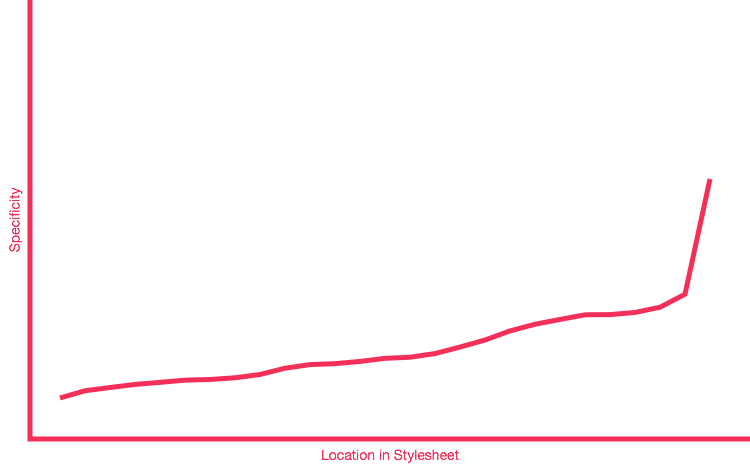
Here's the dependency graph of the compiled CSS (using this tool, it's stateless so you'll have to do it yourself to reproduce). Usually, you want to avoid spikes, and an ideal curve is either mostly flat (no specificity at all) or goes smoothly up (like this) which indicates that the specificity increases with the source order.

Here are some of the issues that the graph has picked up:
- Some selectors are nested (e.g.,
.aa-Autocomplete .aa-Form), others aren't (.aa-InputWrapperPrefix). Is the nesting necessary? Nesting is usually only useful if you have class names that are styled differently in different contexts. In the given example (and others in the code base), it's not the case. I think theaaprefix does the job of isolating the styles already, so unless we need specificity to style the same class differently depending on its parent, we can probably keep them one level deep. - We style on tag name in several occasions (
.aa-InputWrapperPrefix .aa-Label svg). This isn't a huge deal, but it can be less performant given how CSS rules are read by the engine. Another concern is, if users go for an<img>instead of an SVG, they'll have to add custom CSS while they could just reuse the right class on them. - We have compound selectors such as
.aa-Panel.aa-Panel--stalled. This is unnecessarily specific (0,2,0) and that's what BEM modifiers + source order are here to control. Just using.aa-Panel--stalledand ensuring it comes after.aa-Panellowers the specificity to 0,1,0 with no side-effects.
The above examples are representative of other selectors that use the same patterns. An easy way to spot them and fix them is to either use the CSS Specificity Graph Generator used above, or set the Stylelint rules no-descending-specificity, selector-max-compound-selector and max-nesting-depth to a higher severity.
| --aa-panel-shadow: inset 1px 1px 0 0 rgb(44, 46, 64), | ||
| 0 3px 8px 0 rgb(0, 3, 9); | ||
| } | ||
| /* stylelint-enable selector-no-qualifying-type, selector-class-pattern */ | ||
| } | ||
|
|
||
| // Reset for `@extend` | ||
| %reset { |
There was a problem hiding this comment.
What was the rationale behind using placeholder (to use with @extend) rather than mixins? File size?
My usual concern with @extend is that you don't control the final source order, so you can easily run into issues where the final style isn't what you expect. Also, the final size might not be as optimized because it generates long comma-separated selectors that can end up being a lot heavier and not compress as well as a few duplicated rules.
The @extend directive is still useful if used well but it can easily bite you, so unless we've already carefully considered it, maybe we want to move to a mixin instead. We can always compare both versions after gzip/Brotli-ing them if we're concerned about file size.
| box-shadow: inset 0 0 2px #fff, 0 2px 2px -1px rgba(76, 69, 88, 0.15); | ||
| color: inherit; | ||
| font-size: 0.95em; | ||
| font-weight: 500; |
There was a problem hiding this comment.
What's the status on this one?
| // ---------------- | ||
| :root { | ||
| // input | ||
| --aa-search-input-height: 44px; |
There was a problem hiding this comment.
Let's not forget to update the docs, since we list all available CSS variables.
The only concept i'm really attached there is how to discover the full structure of autocomplete just from the css. I tried to reduce specificity without impacting the readability. I think the output css is pretty bad but I've privileged the "fork" experience over the override. Happy to find any good compromise that don't impact the initial intent. |
Description
This is a patch of the theme mainly made by @Shipow.
Changes
aa-ItemVisualfor a wider image to display productsStyles are not yet really clean. We'd like to try this version of the theme in multiple sandboxes that we have and iterate other times.