Cards and Media
In this page the functioning of card and the img tag are explained.
The img tags are in and of themselves responsive. They assume the width of the parent element and automatically ajust the height.
CSS Code:
img {
  width: 100%;
  height: auto;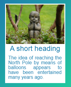
}A card is a image with a legend and a border around it. To round the border use the rounded-corners class.
Atom Prefix:
card
HTML Code:
<article class="card" aria-labelledby="title1">
  <figure>
    <img src="https://bit.ly/2BrBGxX" alt="Hot air balloons">
    <header>
      <h2 id="title1">A short heading</h2>
    </header>
    <figcaption class="content">The idea of reaching the North Pole by means of balloons appears to have been entertained many years ago.</figcaption>
  </figure>
</article>
Example:
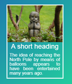
Atom Prefix:
card-reverse
HTML Code:
<article class="card card-reverse" aria-labelledby="title1">
  <figure>
    <img src="https://bit.ly/2BrBGxX" alt="Hot air balloons">
    <header>
      <h2 id="title1">A short heading</h2>
    </header>
    <figcaption class="content">The idea of reaching the North Pole by means of balloons appears to have been entertained many years ago.</figcaption>
  </figure>
</article>
Example: