Try: Fixed Mobile Toolbar, Yet Again #18686
Conversation
 jasmussen
added
Mobile Web
jasmussen
added
Mobile Web
| left: 0; | ||
| right: 0; | ||
| bottom: 0; | ||
| // Cancel the fixed positioning used on Mobile. |
There was a problem hiding this comment.
The comment is a bit misleading as we're not canceling the fixed positioning but more adjustinig the "top" to show the WPAdmin header right?
|
|
||
| // On Mobile the header is fixed to keep HTML as scrollable. | ||
| @include break-medium() { | ||
| overflow: auto; |
There was a problem hiding this comment.
Is this change needed? I mean in desktop the content area should still be scrollable right? (I didn't test yet)
There was a problem hiding this comment.
I think this probably broke the sidebar scrolling. It is scrolling with the main area now, it shouldn't.
|
Great catches, Riad. Addressed. |
|
Thank you for the approval! I take that as a sign that you agree that the trade-off is worth it, given that it's better than what we have today! I still need to do some additional testing, including on some physical devices, and would appreciate anyone who has the time to help with that. @frontdevde do you have bandwidth? |
|
Should we land this in Gutenberg 7.0 to allow it to be tested by plugin users? |
|
Yes, I think so. Let me test it on my Android simulator in a bit and report back. I am expecting it to just work, because it runs Chrome and it should be the same as the web inspector on desktop, but I'd like to just verify. |
|
This branch MIGHT need a little more time in the oven. I just realized that if you visit the post editor URL directly, there isn't a way to get to the rest of WPadmin. This is admittedly edgecase, but we might need at least the "back button". Which is easy to unhide, but takes up space, so needs testing with translations. OR it needs work to unhide the adminbar again. |
|
Actually @frontdevde helped me uncover an additional issue where the toolbar is simply out of view. I'm going to investigate what makes that happen. But it means we do need more time for this one unfortunately. |
|
I've tested the current version of the branch on a physical device, iPhone X running iOS 13.1.3. It looks and works nicely until the soft-keyboard comes into the picture. Then, unfortunately, the behavior becomes quite inconsistent. Sometimes the block toolbar gets pushed up just by a few pixels, other times it sticks all the way at to the top of the page.
(Had to reduce the frame rate to stay within the 10mb GitHub file upload limit.) |

|
I just updated the physical device to 13.2.3 just to make sure the version doesn't skew our testing. Unfortunately, after updating the result remains the same as seen in the video above. |
|
So, I've managed to narrow down what the issue is, and there's good news and bad news. Watch the GIF carefully:
What happens here is:
So what happens here is the Mobile Safari tries to be helpful and scrolls the viewport to vertically center that which has focus, and it assumes that the The good news:
The bad news:
|
|
As outlined by @jasmussen above, this specific issue seems to be caused by the browser's scrolling behavior that occurs when we set the focus on a text block input. This sounded like a use case for
Unfortunately, currently the |
|
@jasmussen and I have continued to look into this. I was able to confirm Joen's hypothesis as to what is causing the issue of the disappearing toolbar. Here's a recording of one of the fixes I tried:
This already works quite well. We have two options: a) find a way to prevent the browser from attempting to scroll at all (what the unfortunately unsupported |

|
Absolutely amazing work, Michael. You should feel free to push your changes to this branch. It looks like a tiny hack that's very isolated, and our understanding of why it's necessary and how it can be one day deprecated (once Mobile Safari improves) is good. Combined with how VASTLY better this is compared to what's in I'll still need to remove some of the hacky experiments I wrote in this branch, and to unhide the adminbare again (perhaps explore sticky positioning again). But with that done, and your iOS changes, this should be good for a re-review. |
|
Encouraged by @jasmussen I pushed a somewhat suboptimal fix. There's probably a better solution out there and I'm continuing to look into it. I pushed it up though as for now, this fix does solve three of the main issues that we're seeing: On the one hand, the issue of the navigation being scrolled off-screen by the browser on focus. On the other hand, once a block is focussed it also appears to remove any whitespace that might have been introduced by the overscroll behavior on mobile Safari. Last but not least, if the user did manage to scroll the navigation off-screen, this fix also corrects that on focus. |
|
I just tested this PR with the navigation block and appears to fix the issue of the navigation block breaking on mobile due to submenu items' toolbar (see #18401).
|
| window.scrollTo( 0, 0 ); | ||
| }, 150 ); | ||
| } ); | ||
| } |
There was a problem hiding this comment.
While I don't understand the hack entirely, I do feel like maybe it's not the right place for it and maybe something for the edit-post package instead (like in the index or a hack imported there)
There was a problem hiding this comment.
I'll try to explain the hack to the best of my ability. We might even want to include this as a comment in context of the hack:
- On mobile,
edit-post-editor-regions__bodyscrolls to enable a fixed top toolbar. - On an iOS device, when the mobile keyboard pops up, Mobile Safari forces
htmlto scroll upwards, even when it shouldn't, moving the top toolbar out of view. - This compensates for that onfocus scrolling.
jasmussen
force-pushed
the
try/fixed-mobile-toolbar-alt
branch
from
35a423e
to
ffd9aef
Compare
|
Gave it a good rebase and squash to simplify and keep the branch fresh. I'm going to look into some of the hack work I've done, see how much I can remove, and to resurface the wp-admin toolbar again. |
|
Removed some hacks, but kept one in that was necessary now that the adminbar is showing again. Also added some additional comments around the iOS hack. The scroll hack looks slightly more pronounced now due to the adminbar showing:
— there's more to scroll! This is another reason to look at refactoring that away. I actually tried including |
|
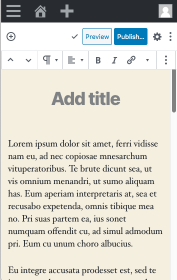
One last thing worth either fixing or looking into, it's most visible in this screenshot of just a small viewport and with scrollbars forcibly enabled:
The top formatting toolbar actually covers content. Are we okay with that? I am — I don't think it's the end of the world — but worth thinking about. Two alternative fixes:
|
|
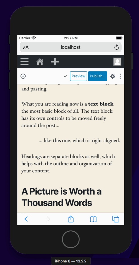
I came here to just leave a comment about being very excited of all the great work has gone on so far. It's a tough thing to solve and already feels so much better looking in screenshots. |
|
Unless there's disagreement about what to do in #18686 (comment), I think we should probably get this merged as it's a step forward for iOS users. I'll rebase and see if the checks pass. |
|
Actually, this rebase is gnarly. @youknowriad if you have a moment, can you look? |
|
this still need to be moved to the right place #18686 (comment) (I can do it a bit later if needed) |
|
Thanks for the updated @frontdevde Feel free to rebase and land :) |
This commit removes some of the hacks, leaves in one related to scrolling now that the adminbar is shown again. It might still be worth it to revisit removing the adminbar, but this is a larger effort.
 frontdevde
force-pushed
the
try/fixed-mobile-toolbar-alt
branch
from
frontdevde
force-pushed
the
try/fixed-mobile-toolbar-alt
branch
from
c6e6732
to
648be73
Compare
|
@jasmussen I just rebased this branch with the current master. There were quite a few conflicts that had to be resolved. Could you help test if everything is still working as expected? |
|
Current status:
Yep, this feels very good to land. I think it's good to go. I also tested fullscreen mode and desktop viewpoints and all looks good. There's one issue we want to look at, but this is a separate issue likely related to moving the mover control to the toolbar, so it could be worth looking at that then (cc @youknowriad as I think you've explored that). Or it needs to happen in the popover component itself:
But again, not a blocker for this PR. I say ship it! |

|
Thank you all for working on this! |
|
It seems that a style filename change in this PR broke the native mobile codepath because there's an import that wasn't renamed to match the new filename. A PR is already up to fix this but I'd like to take the opportunity to raise awareness to the React Native checkbox in the the PR template checklist. The checklist seems to be missing from this PR's description. Thanks! |
closes #18632
closes #14419
This branch is forked off of #18663 and takes it slightly further, but it touches some sensitive sections of code along the way so therefore separate.
The good news: as is, this branch can enable the following Mobile Safari experience:
The bad news is, the following issue is still present:
And what is that issue exactly, you ask? It is explained in more depth in #18632, but it boils down to this:
We have two scrolling containers, and we can't prevent the 1st one from scrolling.
We only want
.edit-post-editor-regionsto scroll. When you only scroll that container, things are good. However,htmlalso scrolls, and we can't prevent it from scrolling. This is what's causing the top toolbar to sometimes disappear off screen, or what makes a white area at the bottom appear. Thehtmlelement scrolls when:.edit-post-editor-regions, pause, and scroll further.As far as I can tell, there are two ways to solve that scroll issue:
overscroll-behaviorfeature to land in Mobile Safari (read more)There is an argument to be made that the currently shipping mobile web experience on iOS is so horrendously bad that the behavior in this branch, as is, is an improvement. For that reason, we might want to consider shipping this as is, and hope for Mobile Safari to improve soon. I'm increasingly skeptical that diving into JS hacks is a good idea, and even if we do, we could potentially do it separately from this PR. What do you think?
If you all agree this PR is a step forward, regardless of the Mobile Safari bugs, there are a couple of things that need to happen in order for this PR to be shippable: