Try a new hover and select approach to improve nested block selection #6773
Conversation
 jasmussen
added
[Type] Enhancement
jasmussen
force-pushed
the
try/alternate-hover-approach
branch
2 times, most recently
from
jasmussen
added
[Type] Enhancement
jasmussen
force-pushed
the
try/alternate-hover-approach
branch
2 times, most recently
from
8436bda
to
839eb28
Compare
|
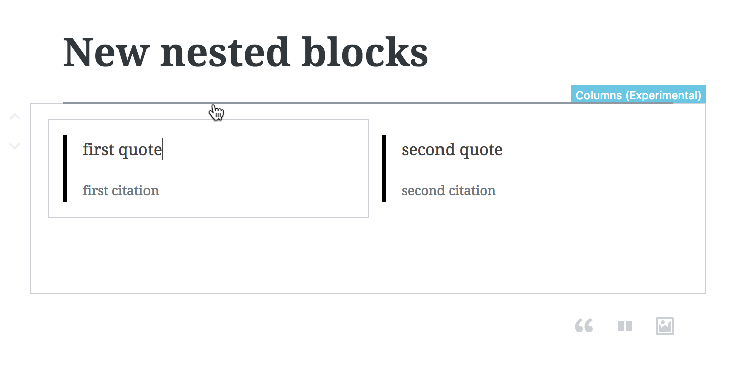
This has been rebased and squashed, so the quote block no longer uses nested blocks like it does in the GIF above. Please test using the Columns block. |
There was a problem hiding this comment.
@jasmussen thanks for the ping. Tested with columns and two quotes. First impression is that is not immediately clear when/why the "breadcrumb" labels appear and when not. They appear on hover, but not when the block is selected, that's a bit confusing.
Aside: I guess the breadcrumb labels were introduced specifically for the nested block but they also reveal that sometimes there's the need to identify what a block is. They're basically visible labels, I wonder if it could be beneficial to always show them, at least when the block is selected.
The color contrast of the breadcrumb label is not sufficient. See .editor-block-list__breadcrumb has two background CSS properties, the latter prevails and it's $blue-medium-300 #66C6E4 with white text. The contrast ratio of 1.95:1 https://jdlsn.com/color/?type=hex&color=FFFFFF&color2=66C6E4 should be at least 4.5:1

In some cases, for example when hovering the "horizontal inserter" the label appears:
That's potentially very confusing, as users may think the label is related to the inserter.
Keyboard interaction: yes as you pointed out there's the need to improve it. Also, the "Add block" plus icon appear only on focus, which makes them hardly discoverable.
|
Great review, will try to address your points. Keep it coming. |
|
I think this is a big step in making nested blocks easier to work with. See also #6224, which isn't explicitly related, but definitely has some crossover in terms of exploring the block interaction UI. |
There was a problem hiding this comment.
This is a huge improvement! Thanks for working on this @jasmussen. Experience and design wise I am going to approve this, noting that the accessibility improvements are already being worked on.
 jasmussen
force-pushed
the
try/alternate-hover-approach
branch
2 times, most recently
from
jasmussen
force-pushed
the
try/alternate-hover-approach
branch
2 times, most recently
from
5ff0445
to
53a46ad
Compare
|
Rebased, squashed, and fixed an issue with full-wide blocks. |
| @@ -647,6 +653,9 @@ const applyWithSelect = withSelect( ( select, { uid, rootUID } ) => { | |||
| block, | |||
| isSelected, | |||
| hasFixedToolbar, | |||
| rootUIDOfRoot: getBlockRootUID( rootUID ), | |||
| orderOfRoot: getBlockIndex( rootUID, getBlockRootUID( rootUID ) ), | |||
| @@ -647,6 +653,9 @@ const applyWithSelect = withSelect( ( select, { uid, rootUID } ) => { | |||
| block, | |||
| isSelected, | |||
| hasFixedToolbar, | |||
| rootUIDOfRoot: getBlockRootUID( rootUID ), | |||
| @@ -647,6 +653,9 @@ const applyWithSelect = withSelect( ( select, { uid, rootUID } ) => { | |||
| block, | |||
| isSelected, | |||
| hasFixedToolbar, | |||
| rootUIDOfRoot: getBlockRootUID( rootUID ), | |||
| orderOfRoot: getBlockIndex( rootUID, getBlockRootUID( rootUID ) ), | |||
| isSelected, | |||
There was a problem hiding this comment.
Duplicated (already assigned above). Thinking there ought to be an ESLint rule for this.
Edit: There is and it's enabled. I'm guessing it doesn't support the ES2015 property shorthand in the version we're using.
Edit 2: It is actually error-ing 😄
There was a problem hiding this comment.
Duplicated (already assigned above).
Removed in 11d7161.
| ) } | ||
| { rootUID && ( <span> → </span> ) } |
There was a problem hiding this comment.
Directionality has me wondering how this appears on RTL.
There was a problem hiding this comment.
Is the span necessary? Could this be { rootUID && ' → ' } ?
Edit: I see we're applying styles. We should probably do so with a class.
There was a problem hiding this comment.
Directionality has me wondering how this appears on RTL.
[...]
Is the
spannecessary? Could this be{ rootUID && ' → ' }?
Updated to an element with :after pseudo-class content (and RTL flipping) in e650954.
| @@ -53,7 +52,7 @@ export class BlockBreadcrumb extends Component { | |||
| } | |||
|
|
|||
| render( ) { | |||
| const { uid, rootUID, selectRootBlock, isHidden } = this.props; | |||
There was a problem hiding this comment.
If we're not using selectRootBlock, the composed withDispatch can be removed.
There was a problem hiding this comment.
If we're not using
selectRootBlock, the composedwithDispatchcan be removed.
Removed in 11d7161.
| * | ||
| * @return {boolean} Whether the block as an inner block selected | ||
| */ | ||
| export function hasSelectedInnerBlock( state, uid ) { |
There was a problem hiding this comment.
What about an inner multi-selection?
|
3a0aac3 changes the behavior to tab to the block focus stop first if there are inner children, before proceeding to the inner blocks (in order, so ArrowDown from a previous block). b2c869a adds an overlay on small screen unselected root blocks so that it's required to tap on a nested block wrapper before tapping one of its child blocks. |
|
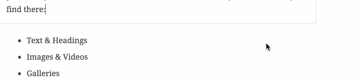
Thanks for those two fixes, @aduth, it's working great! I noticed that I can't add anything to the 2nd column in the columns block:
Do you know what might have caused that? |

|
Looking good! Some thing to address:
|
|
Pushed a few fixes:
I worry that will make it a bit fiddly to know what you're interacting with. The biggest challenge is that this will make the block toolbar sit in a fashion that might make it look detached. We can definitely explore addressing that — perhaps the block toolbar gets a little triangle arrow that shows what it's connected to. But I think this should be explored separately.
The sibling inserter does need a little further love since the most recent iteration, but at least now you don't accidentally invoke it all the time. But can you clarify why you'd want to click the label? The label doesn't do anything anymore, it's purely informative.
I know. This is because we reserve 28px to the left of all blocks for the side UI, so the clickable area to select the parent actually starts outside of that clickable area:
Right now the extra wide padding is present on all top level blocks, but not on nested blocks. Some options:
|


|
P.S. I could use help with a rebase, not sure what's up with the store now. |
|
@jasmussen I think making the up/down arrows double as drag handles is a great idea. I think that if you did that, you could also make the block toolbar double as a drag handle as well, providing more than enough space to drag a block from without adding any additional weight to the UI. Right now, I think the dragging from the side of blocks is kind of confusing. It looks like you are outside the block boundaries, and there is little indicator that the side area is connected to the block. This could be resolved with adding a hover effect to the side of blocks, but I would prefer if the side padding was simply done away with and the arrow buttons and/or block toolbar were made into drag handles. |
|
Just one little thing I found, on a classic block the hover label is obscured by the classic block header.
Also, I feel like the blue doesn't quite fit in with the color scheme... but no one ever asked me to coordinate their outfit colors, so perhaps don't pay too much attention to that :) |

|
Great catches. Will fix the classic block, it looks wrong entirely, and using a theme color for hover and label might be a fun splash of color. |
|
Changing the color of the hovered block and the label to match the admin theme is easy to do, but I would like to do it separately to keep this PR from growing further. I fixed the classic block:
|

|
Looking good! |
|
I'm seeing the spacer block missing controls on this branch:
|

Noting as unrelated to these changes. See #7024, #6922 (comment). |
| &:hover, | ||
| &:active, | ||
| &:focus { | ||
| z-index: z-index( '.editor-block-mover__control' ); |
There was a problem hiding this comment.
Knowing z-index to be a source of maintenance headaches, I might like to see some inline comment either here or in z-index.scss explaining why it's needed. As it stands, I have no idea why we need it, even at this moment in time, let alone my future self.
There was a problem hiding this comment.
👍👍 Adding a comment.
| } | ||
|
|
||
| // Only show the left border if the Switcher is present | ||
| .editor-block-switcher + div > .components-toolbar { |
There was a problem hiding this comment.
This seems very prone to future breakage, particularly on the + div sibling part, since the div it refers to exists only for adding a left border in a set of toolbar controls. This has no reason for needing to be a div specifically, and could otherwise be refactored to a solution which no longer requires the div wrapper at all.
Instead, I'd like to see one of:
- Adding a
border-rightto theToolbarof theEditorBlockSwitcher - See what we can do about removing this "seemingly redundant wrapper"
divand change selector to applyborder-lefton.editor-block-toolbar .components-toolbar:not( :first-child )- Alas, we can't use
:first-of-typefor anything except an element tag (reference). Well, maybe someday).
- Alas, we can't use
- Add
hasLeftDivideras a prop to control / override the existing behavior ofToolbarin applying the.has-left-dividermodifier class
There was a problem hiding this comment.
The first idea was a solid bit of advice. Did that:

Add border to switcher component instead.

Add comment to explain z index.
|
🤘 |
|
Dragging seems broken here |
|
@iseulde If you're referring to the block label, dragging has never worked there. I know it's been mentioned a few times as being desirable, though unsure if there's an issue tracking it. |
|
Well, it does work for me — it's just that you have to click and drag and it's not a great experience yet. It was my intention to create a separate ticket for this, including a ticket to improve the sibling inserter and theme the hover color, per feedback in this thread. But it's been a whirlwind so creating that ticket is still on my "todo". But the gist is I'm going to suppose sort of a rejiggering of dragondrop so it's only the label that becomes the drag handle, and not the sides. But I'm sure lots of discussion and idea refinement will ensue. |
|
The reason I'm mentioning it here is because the grabbing hand indicates that the block can be dragged by that label. |
|
Clicking and dragging that area is working for me, though, even if in a way that doesn't give the best visual feedback. Is it not for you? |
|
@jasmussen Drag and drop from the hover title is not working for me either. (Tested in Firefox Nightly.) The cursor becomes the drag cursor when I hover over the title, but when I try to click and hold on the hover title, it just selects the block. |
Per feedback in #6773 (comment), it seems the drag handle for the breadcrumb was premature. Although it works on the edge, it's not consistent and was a bad idea.

This simply removes the grab handle. I will open a separate ticket for making that work.
|
It worked on the edge, but I see why there's confusion: it doesn't work on the whole breadcrumb. So yes, it was definitely too early to add the grab handle. I've opened #7083 PR to fix it. |
Per feedback in #6773 (comment), it seems the drag handle for the breadcrumb was premature. Although it works on the edge, it's not consistent and was a bad idea.

This simply removes the grab handle. I will open a separate ticket for making that work.
|
|
||
| @for $i from 2 through 6 { | ||
| &.has-#{ $i }-columns { | ||
| &.has-#{ $i }-columns .editor-inner-blocks { |
There was a problem hiding this comment.
This change seems to have inadvertently caused #7127, where the stylesheet is used for both the editor and front-end, but the markup generated from the front-end will not have .editor-inner-blocks.
This PR aims to solve a number of issues we've had around selecting nested and parent blocks. Watch the GIF first:
It also tries to take the vinegar out of the hover label, and makes it feel much less fiddly to work with blocks in nested situations.
It does this by making the parent block side padding much wider than the nested block padding. But only in a visual way, using negative margins on the UI. That means the appearance of the blocks should not change visually, the goal is still to be 1:1 with the front-end, and further enhancements to nested block paddings are coming in #6408.
For starters, please try out this branch and get a feel for it. Depending on feedback and aside from polish, there are two remaining to-do's for this branch:
Your thoughts and feedback are appreciated.