Proposal: UI for Long-Lived App-Wide Status Messages #913
Comments
|
@sapallie, could you make the design mockups accessible publicly? Unless they're not to be shared at this point. |
|
Currently doing XAML development, and I'd love to see something like this. Or, something like a nice scrolling message control. From a Microsoft branding standpoint, a standardized error banner seems like it could go horribly wrong. I'd fear end users associating every application error with the Microsoft brand. I just read the proposal, and first thing that came to mind was memelords tweeting about the flashy banner of death. |
Sorry @adrientetar, I can't share them just yet. The designs are Microsoft only for now. |
|
@sapallie, thank you for this phenomenal feature idea! I am a Program Manager for WinUI and I am excited to pitch this to the team! I wanted to write a little bit about our process so that you can be in tune with how we'll proceed from here. Starting now, I'll work to refine the high-level scope/requirements of this proposal and the justification for the development. Then I will pitch it to the rest of the WinUI team and we will deliberate on whether it aligns with our Road Map (#717) and if we think we can act on it relatively soon. If so, I'll be approved to figure out the details and begin spec writing so that the feature will be ready for a developer. Here are few things I already know I need to get a bit more of an idea for...
Is your proposal for an edge-to-banner? Or a notification tile like what Windows Notifications do but in the app window such as the in the center, along the bottom edge, or in a corner?
I don't think I would be able to get this proposal approved without being able to include a public visual of the request as the repo is open source and close-sourcing the visual side of the conversation would entangle the process and experience for our community. Based on responses to the above, I am happy to take a shot at drafting a mock up for the proposal. Would you prefer this or do you have a timeline envisioned for granting your permission to make your design public? I love your mockup and would be eager to have them included in our brainstorming here lest we unnecessarily take the discussion in a divergent direction to your intention. Please let me know! 😊
Am I correct in reading these statements to mean you also need to have the option for a non-dismissable bannerfor critical errors? If so, could you tell me more about your specific app scenario for recieving one/proceeding from the point of having a non-dismissable banner? Are the users relegated to close the app unless the problem is solved? Or is this where the buttons would come to, say, navigate them to the Network & Internet settings page? Thanks again and I look forward to refining this idea! Everyone, please feel encouraged to contribute your needs, designs, and perspectives to this conversation! 😊 |
|
I would like to say, there are a few proposals that all ask for a similar thing. Rather than make this specifically an Error banner - why not just bring in the In App Notification from the Community Toolkit. There could be an icon property added, which would make it show an error icon, or a confirmation icon, etc. |

|
@SavoySchuler – good to hear from you. I tried to answer all your questions but please let me know if you need anything else. Visual behaviour: Dismissing:
And I think all of these should be dismissible (I updated that in the proposal description as well) Example visuals |

|
I really like those visuals for the banner. I would move the text and icon up by 4 px, so they are centred in the white area, rather than the white and coloured bar. |
|
Agreed. The posted visuals look quite nice. |
I haven't counted the pixels but it looks as if these are centered if the space for diacritic marks above the X-height is accounted for. |
|
@sapallie Have you made any thought about allowing these controls to be automatically, or programmatically dismissed? If prompting about being/going offline, it would make sense to programmatically remove such a prompt when online again. (I've seen apps not do this and it can lead to a confusing experience.) Similarly, having non-essential messages not displayed indefinitely can avoid unnecessary UI clutter and can prevent power users from needing to get out of flow once they've read a message by not forcing them to manually dismiss the notification. I understand that there are potential extra accessibility considerations around such a control and these behaviors but I believe these ways of dismissing the control are essential. |
|
I think it is important to call out that such a control is not intended for general messaging within an app. Unless that really is a desired use case. |
|
Should an app be allowed to display multiple banners at once? |
|
This would satisfy those who have asked for an Android Toast style in app notification control, it could also possibly be useful for validation scenarios, to display error text where space in the form is at a premium. I would also call it something like a StatusTip or StatusNotification so it won't only be associated with negative uses. I assume the design would adapt by changing the placement on the solid colored bar when it is placed at the bottom of the window? It should probably have a timeout property, and could even have the ability to show a pending message, like a progress ring and some text like "Logging in now" before switching to a confirmation of error message. |
I think it was more likely that the text was vertically centred in the box without taking into account the coloured bar
Here is how the coloured bar placement could change with the placement of the control |


|
@mrlacey yes, programmatic/automatic dismissal for when the banner is not relevant anymore is quite important – I added it to the proposal description. Status changes and errors: That’s what the banners should be used for. Not general messaging – I agree on that. And I think multiple banners should work. They should just be stacked. |
|
@mdtauk I renamed it “Status banner” – thanks for your suggestions. For the loading state – I don’t believe that should happen in the banner. Loading content should be displayed in the app where the content would actually appear. And when it comes to changing the placement of the coloured bar – it’d be great to have the flexibility there depending on where the error banner is placed in the app window. 👍 |

|
@sapallie Your note on critical error circumstances is interesting with respect to the suggested guidance that status banners point the user to a solution. My intuition is saying that you may also need an API to disable, or at least temporarily dismissability?
@mrlacey, great callout! Fortunately, I have worked through a significant portion of this during consideration of timed auto-dismiss on TeachingTip, and while some partnering with teams that own accessibility settings would be necessary, I do not believe this feature would be blocked on account of accessibility concerns. +1 on all your other points! |
|
Could there be the ability to add a HyperlinkButton linking to a solution, or to a settings shortcut, like Networking? |
I was envisioning the subtext containing a hyperlink to an in-app or Settings App (see TeachingTip's Xaml Control's Gallery Code) page. Were you thinking of something more standardized @mdtauk? |
|
@SavoySchuler Content property instead of MessageText? |
Yeah, possibly I guess… Definitely doesn’t hurt to add it. It adds flexibility after all and will probably be quite useful for some use cases. |
|
I would not advocate for harmonization between these controls directly, as there is justification for these controls doing their own thing within their own contexts. However, creating an In App Messaging API, which acts as a unifying structure, but can adapt for the form factor doesn't need changes on the controls. There are questions to discuss and answer for this kind of API:
And probably many more I have not thought of lol Taking Xbox as a platform Full width Information Bars would need to take into consideration overscan on the screen edges, and so for these apps, an Information Card may be more suitable. But how would you handle dismissing? No cursor to move over a close button, but do you want the Card to take over the controller inputs? This makes it modal. But then if it is overlaid on top of content, how do you select it and give it focus? So then does it appear inline and push content down, but not be full width? Plus Xbox has its own toast like notification system, so would / should this API work with that? Can it work with it, or is it System only? |
The goal should always be provide common API's for the same things. This whole discussion is about user-facing messages in general and several similarities appeared once that was understood. It's unarguable that the use cases for TeachingTip and a MessageBar-type control are different. Fundamentally, one is presenting a Message and the other a Tip as well. I'm not questioning the overall design choices here. However, there are FAR more similarities than differences with these controls. Just look at the design alone: they all have icon, title, subtitle, content, action button and close button (yet you named them differently and there is a different API surface area). If you don't see why it's a good idea to standardize at least naming and enums here there is nothing more I can say. This is just something fundamental to good architecture. For buttons, both controls support an action button and a close button. But you did this completely different ways. You explained some reasons above but now we have an 'ugly' API for using buttons in situations like this. Why don't we generalize this now so we have something good for the future? Buttons like this apply to several controls: ContentDialog, TeachingTip, InfoBar and who knows what next. We keep designing thinking about the current control only - bad architecture!
For the text of the message or tip one is called Overall, wouldn't it be helpful for developers if the controls just worked in the same way? Yes, of course! Does that mean there will be the same control underneath all of this? Not necessarily, but we should be using the same property names, the same action button concepts and the same types. I'm still hoping we could have a message structure or interface used to tie everything together though. Wouldn't it be great to just set a message to the MessageBar and have it be displayed instead of having to set all these properties manually?
My end conclusion of the comparison is that MessageBar/MessageCard should be the same control and also support the use case of my inline hint or tip example through styling customization.
Edit: Overall I think my fundamental concern is we somehow went backwards in architectural thinking. Control design is now done as if it was the Windows Forms days. New UWP controls should be based on WPF concepts. Controls are getting highly specialized and I don't see the unifying threads spanning the framework that really 'wowed' developers who first touched WPF. We must get back to the 'big-picture' mentality in my opinion. |

|
I agree 100% with @robloo that property names and enum names for similar things should be aligned (as far as possible) with existing controls. Similar controls should have a similar API surface. If a MessageCard class was to be added at a later point (instead of extending MessageBar, which I might personally prefer), it should at least have a very similar API as MessageBar. |
@lukasf Are you aware of the XamlUICommand class? That allows you to bundle these properties in one place and then assign them to your Button/MenuItem/.... by just passing your defined XamlUICommand to the |
|
@Felix-Dev Yes you are right. I almost forgot about that. I am not using it since it was not available in WinUI when I tried it last time, but also because it is not a full solution. AppBar and ContextMenu have more than just command links. For a full solution, we would need:
What is also missing it a "Visible" property and/or a property "HideIfDisabled". Then we'd need an ItemsSource on MenuFlyout and AppBar/CommandBar and similar controls. The top level control would then create the corresponding sub controls for each command item. Only when all this was in place, we could have one collection of commands in our app, and bind them to MenuBar, ContextMenu, AppBar, NavigationView. But as it is now, I need to keep a list of custom defined classes, manually implement and use stuff like DataTemplateSelectors and other annoying workarounds, just to get the same command definition working in different places. XamlUICommand was a good start, but it is not a complete story. |
|
Apologies for my delay in response here, @robloo thanks for sharing your perspective and the comparison table from a couple of weeks ago. I really appreciate all of the thoughts and considerations going into making WinUI better! 😊 In InfoBar and throughout the platform, my view is that while designing we are striving to find the right balance for controls to be specially designed for specific scenarios as a defined UI pattern – while generic and customizable enough to extend to the scenarios we haven't yet identified. As someone newer to the team I'd love to hear why WinUI controls should go back to WPF concepts. What day-to-day problems are you and other UWP devs facing when similar conceptual controls don't have the same underlying structure? What benefits are there for you so we can understand better why we should dedicate resources towards creating this structure? Are there other controls in WinUI that would benefit from being unified (I see the button conversation above from @lukasf) I think we can also continue this conversation in a new general issue if there's an area where we can modify existing controls/brainstorm approaches for future controls. @SavoySchuler for any input here. For InfoBar, I still don't foresee any changes as it goes into preview from this conversation. For the Action Button and Close Button APIs in particular if there are specific needs that aren't met please let us know so we can evaluate any potential changes. I could anticipate a common AppMessage base class or interface to be implemented with a v2 in association with an InfoCard control or as a separate DisplayMode to enable the variable layout 'Auto' functionality @mdtauk brought up earlier. Additionally, the WinUI team doesn't yet see the value in further aligning Teaching Tip and InfoBar at this time, however we can continue conversation here to address this if there are usage needs not being met. Once InfoBar goes into preview and can be implemented in applications any specific scenario or usage feedback would be great to hear before the official release. As a general ask, if you have scenarios that match the intention of an InfoBar and there are aspects of its functionality or visual design that don't meet your needs, please let us know as we go into preview. Thank you again for all of your comments and conversation! |
The point of having structure is so programmers can code quicker with less errors in order to have high quality code. Because much of Microsoft are siloed teams, in many cases there are multiple ways to do something but no unification of said procedures which results in redundancy and trying to fix something that is already fixed. After WPF was created, Microsoft went into a "it's good enough mind set" this directly is expressed in the quality of the apps even from Microsoft's own teams. If Microsoft's own inbox apps can't get on the same page with high quality uniform consistency in the code & uniformity of apps, how do we expect 3rd party partners to deliver such? Delivering generic but customizable code results in generic baseline apps. Most developers aren't going to put in the extra effort to make their app look functional and polished, they will only do enough to make their app functional. This level of "do enough to make it functional" is picked up by the end user as "half assing it". In my opinion, the point of controls is to have high quality code that you can just use, and you can customize it based on if you wish to. |
|
Giving the developer options, for how they use controls has its positives too, instead of locking them into a single way of managing messaging and notifications. But ensuring whatever option they pick, looks and behaves in a familiar way, and "belongs" with Fluent Design - has the benefit of consistency. So if the controls themselves in WinUI don't provide a unified approach, perhaps the Windows Toolkit could create a helper API that manages it. I would suggest you propose it in that repo, and it can use the WinUI controls to present it in app |
|
Hi everyone, as an update the InfoBar control is now in preview 🎉 If you have an application that would benefit from this control please try it out and share your feedback with us. |
|
Here is another example of an Information Bar/Box/Card
|

|
Edit: I just realized the below issue is already fixed by #3581. Please disregard the issue below. Thanks for making the control! It looks great in Nightingale :) @gabbybilka I'm going to use infobar in my Nightingale REST client app. It's perfect for one of my scenarios. In my quick testing, it looks like the icon in the info bar doesn't support light theme? Or maybe I'm doing something wrong in my XAML usage of the control. Here are some screen shots |


|
Would you consider to add a "Opened" event to the control? In some cases it's appropriate to auto-close the InfoBar after a few seconds. An "Opened" event handler would be the right place to start the timer. |
|
I think the Success colour, in the Dark Theme should be changed. @YuliKl @anawishnoff @chigy @teaP
#1d3d1bIt is not just for the Aesthetic value, but also because the more olive coloured bar is not as distinguishable from the Warning colour
Here is how it would look
|


|
@mdtauk I like that idea although this isn't my area - pinging @gabbybilka so she sees your feedback above. |
@XamlBrewer Thanks for jumping in here! I'm hesitant to add an "Opened" event to the control for just auto-closing scenarios. When designing the InfoBar we specifically were focused on uses that ensured the user would be able to at minimum acknowledge and skim the message. If messages auto-close then some users will miss the message altogether and I question whether an InfoBar should have been shown in the first place. An InfoBar takes up space in a layout and auto-closing it may unexpectedly change the UI for users when they are actively interacting with it. What kinds of messages are you planning on showing with the InfoBar that could also be missed by the user and time-based instead of state-based?
@mdtauk Thank you for the note and the color suggestion! The toned down dark theme colors were motivated to keep consistency with the Fluent colors and a general more muted Windows palette. Digging a little deeper the contrast between the Warning and Success colors is only 1.05:1 which wasn't as obvious to me initially. Could you open an issue on the lack of contrast between the two Severity states? We can continue to iterate and find a solution there. Thank you! |
|
@gabbybilka Knowing what is best for an app or usage scenario is not always up to Microsoft. Sure, Microsoft sets guidelines but there are always special cases. Purposely blocking adding an event like Opened because Microsoft is making a blanket assumption for how the control is used seems like a very bad way to develop a framework. This is a very useful event in several scenarios and it shouldn't be up to Microsoft to artificially restrict usefulness like this. In fact it's opposite of how we want to develop frameworks. Frameworks are tools for developers and Microsoft should be giving the best and most powerful tools for developers. It is then up to developers and their organizations to decide what is best for their users and scenarios -- not Microsofts. Your customers in this case are the developers not end users. Please reconsider the Opened event and add it. |
I shall make a new issue. I can understand the muting of the palette, but it was more about the shift in colour tone, where it doesn't scan as a green colour, and looks too yellow which could be confused for the Warning colour. The actual Warning colour has shifted into the orange too, and could be too close to the Critical colour. Is this shifting to warmer tones intentional, or was it just an accidental choice. As the foreground colours don't show any shifting to other hues.
|

|
@gabbybilka Here's an example of an InfoBar that could (and should) auto-close:
Visual Studio shows a yellow bar as long as the action is busy, and a red bar when something went wrong. None of these auto-close, which is fine. On success the same UI is then used for the information bar. In a lot of cases it makes sense to auto-hide that last one after a few seconds. |

@XamlBrewer thank you for the example! Are you planning on using an InfoBar in a similar scenario? To make sure we're creating the right API for your needs, if you are confidently planning on using an 'Opened' event please share the general description of your app and the situations where this event would be used. I've opened up a feature request/discussion and would love to better understand. |
@robloo Thank you for consistently sharing your devoted voice as a customer on this thread and throughout the repo. I really appreciate your effort in making sure we're attentive to developers as our primary customers and accountable to their interests. This extra effort ensures that we land on the right outcome. In my previous post I may not have communicated my perspective clearly and I apologize if my initial thoughts were perceived as dismissive. To give transparency on the API evaluation process, I'd like to share how we assess new functionality. Perhaps this can help us come to a resolution :) With the demand on our team for new controls, features and capabilities, a guiding principle has been to bring a need-driven approach to control development and API inclusion. In my own words, I'm driving API inclusion by asking the following questions:
When an API was needed but wasn’t included, we expect to catch this in Preview validation as a broader net of customers begin stress testing the new control/feature and surface gaps arise. If a credible need comes up after release, we can add it later with our rapid release cycle. I believe this method of being surgical in defining API requirements means that we can focus our limited time creating functionality that we're confident will serve real and ready customers immediately. Considering the opposite, if we are including functionality without adoption ready customers or by the premise of “the knob exists elsewhere so it should be added here also” we spend more time on a broader net of esoteric/low-yield additions which can bloat the platform with complexity and perf implications. Let's evaluate the 'Opened' event with the following criteria.
I’m open-minded here to the idea my judgment is mistaken or that there’s room to complement my perspective with the insights only real or (especially) veteran customers might have. What additional justification criteria should I be asking here that would account for this need while still appropriately work to prioritize the ROI of our finite engineering resources? To continue the conversation I've opened a feature proposal/discussion. My goal here is to be a steward of WinUI customers and users via prioritizing where we invest our limited engineering resources (which also means deciding where and why we don’t), not to artificially restrain you as a developer for its sake alone – that would be especially purposeless considering WinUI is working towards being fully open sourced and the ability to add capabilities like this will then be in your hands directly. Looking forward to finding resolution here, @robloo - ideally one you’re happy with. As a newer member of the team, I'd like to improve on understanding our customers needs with your feedback and steering the ship in the best direction. Your continuous involvement in the WinUI contributor community is impactful and suggestions always taken into consideration 😊 TLDR; I really appreciate the continued feedback and perspective to ensure we are creating the correct capabilities for our customers given the limited resources we have. I've created a feature proposal/discussion for the 'Opened' event to further discuss this and identify whether this is a critical baseline requirement or a significant need for your application using InfoBar. Thank you! |
|
@gabbybilka Love what you shared on decision making principles around API inclusion. I think it would be welcome to elevate the content you wrote here to some kind of "Tips & Best Practices" section of our "contribution guidelines" or similar. Creating clarity around the decision making process for identifying API inclusion cut lines stands to help everyone (especially repo rock stars) get the most out of the time they share engaging with the team to contribute ideas, requests, and feedback! 🙂 |
|
@gabbybilka I do appreciate you taking the time for such a thorough response. I should have changed the very last part of my comment above. Instead of asking for the event to be added by Microsoft I am only asking that it not to be rejected. This is a perfect place for a community contribution so there is no need for Microsoft to invest the limited resources you have on it -- only that you don't obstruct others from doing so. I do understand Microsoft must follow a need-based development approach in several, if not most, areas. You are correct that my primary concern was how quickly you shut this idea down (the Opened event). It is not a new API in concept and it's used in several other controls. Therefore, the risks from having to 'maintain a new API are quite low here. We aren't going to accidentally name this the wrong thing. The maintenance burden is trivial. Instead of approaching it from a “why do we need it” viewpoint, why don’t we approach it from a “why not” viewpoint? (Again, the community can take the limited resources out of the equation) I firmly believe that we should error on the side of giving functionality to developers. The 'why not' mentality. In that way all are empowered to explore the solution space better and come up with novel UIs that may be better suited for their users or applications. Things Microsoft never thought of. Who can know what future features will exist? Lots of good ideas are only possible because of the smaller ideas and features that came before. If we must defend each small but good idea some future high-level features might never be possible. They won’t be possible simply because they couldn’t be envisioned without the smaller features and ideas leading up to them. Those smaller features and ideas never saw the light of day because they could not be defended as necessary without the future high-level feature in mind. A real catch 22. This is the most fundamental reason we need to keep an open mind and adopt a “why not” approach to framework development. So, I think this 'Opened' event is a perfect example of a small shift in mentality I have been pushing for in WinUI. Instead of shutting down features and requiring they be significantly useful before being added, it would be great to instead be able to judge with some insight what are good/not-good ideas and simply add the good ones. Again, developers would be free to pursue what they see as best for their own applications and then ideas fed back into the framework from their successes. [I'm going to generalize here and am no longer talking about this issue specifically] However, the obvious problem appears: how to judge a good idea? This is an unfortunate situation we are in with all Microsoft XAML frameworks right now: lack of vision. While WinUI is a great start I'm not confident there is a unifying vision past WinUI 3 reaching feature parity with past frameworks. Those that can judge a good idea from a bad idea are those that have a feel for the product and really understand where they want to see it go in the future (a vision). That kind of insight starts from an in-depth knowledge of XAML, its history, why past decisions were made, and practical experience using it in apps over the years. I’ve seen only a handful of individuals within Microsoft still involved with XAML that have a vision for how things should be and are confident of a good idea when they see it. Those individuals don’t seem to be in decision-making positions that we engage with here. They are not the gate-keepers of good ideas and resource allocation. |
|
I don't want to dive into the discussion @robloo started. But I think it is obvious that a control should communicate it's state. So we'd either want to have Opened/Closed events, or some DepencencyProperty we can listen to. To me, this is base behavior that any control should have. It does not need to be in V1. But if anyone wants to add it, then I don't see a logical argument against it. |
 and others
Proposal: UI for Long-Lived App-Wide Status Messages
Summary
Add new UI for long-lived app-wide status messages for scenarios such as updates available or errors that may occur which prevent the user from experiencing an app or its features working as intended.
Rationale
Scope
Scenarios
Critical Scenarios:
Non-critical Scenarios:
Design mockups:
Status Card
They are similar to Teaching tips but should be used for prompting users about errors or important status changes.

Status Bar
In-app-UI banner similar to what is currently in use by M365:

Your Phone App error message:

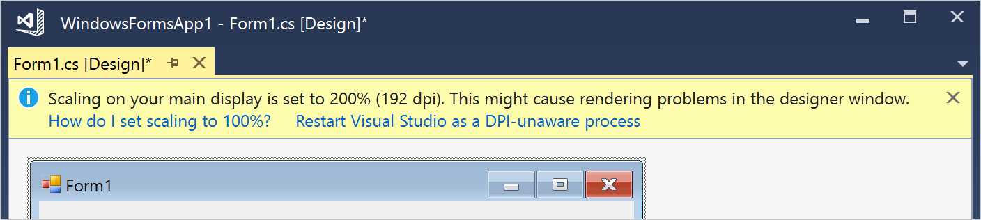
VS Designer banner showing 2 separate links:
"Recording started" message in Teams:

InAppNotification
Port from Windows Community Toolkit to appear from the edge of the app window as an overlay UI control.
Open Questions
Scenarios/Requirements for this UI:
The text was updated successfully, but these errors were encountered: